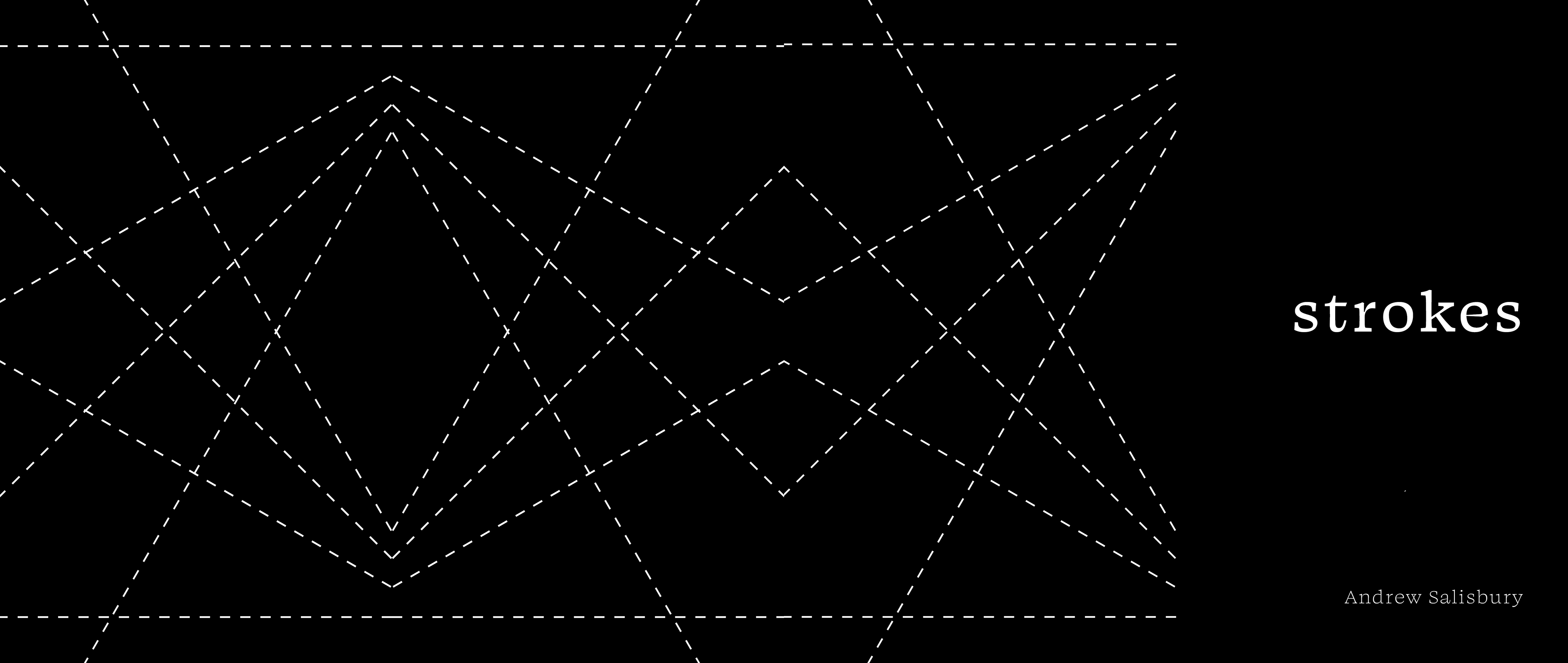
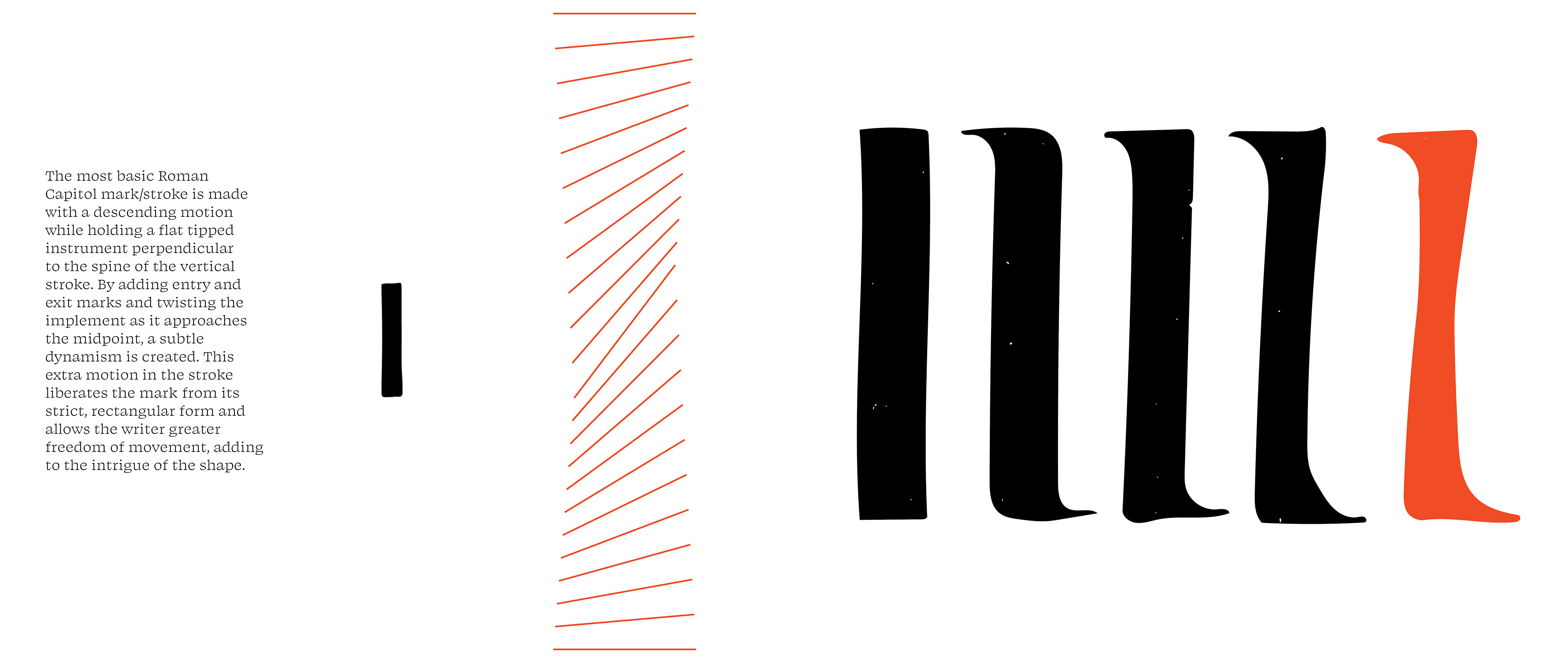
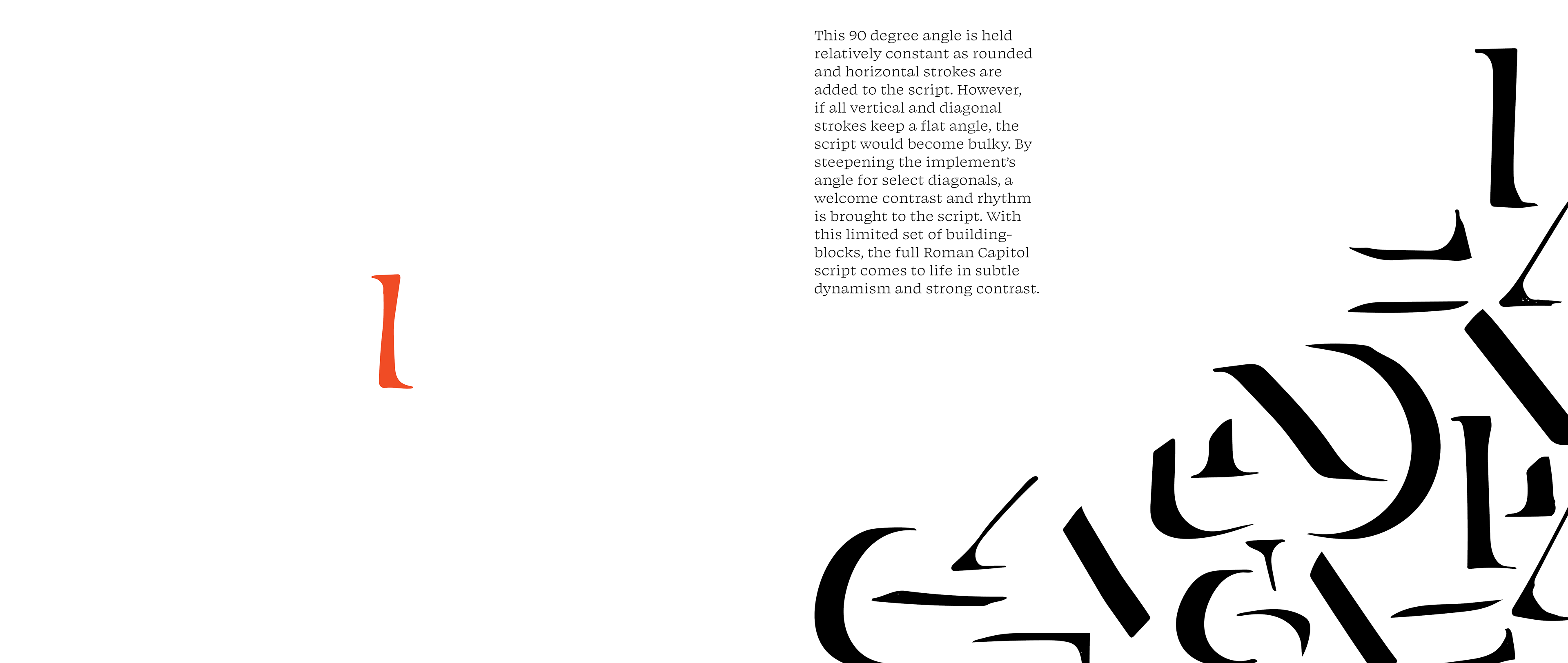
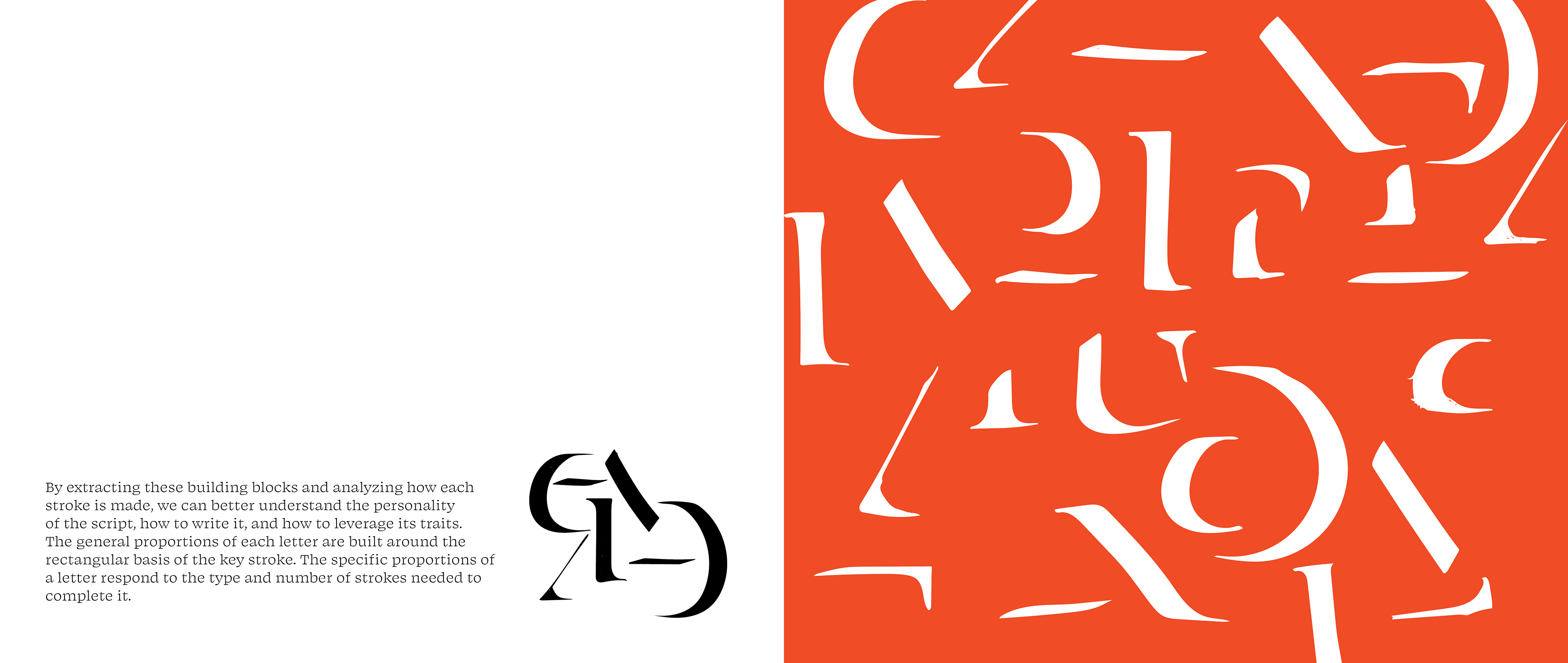
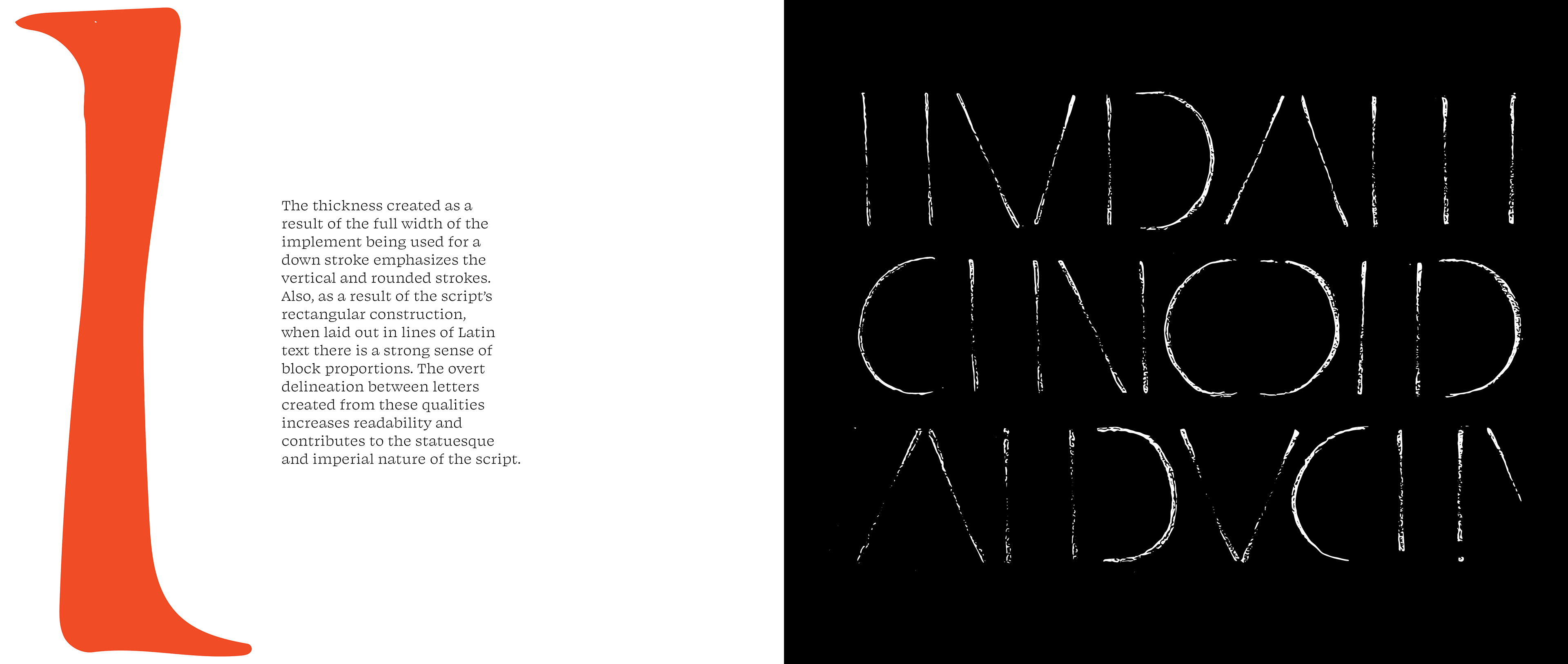
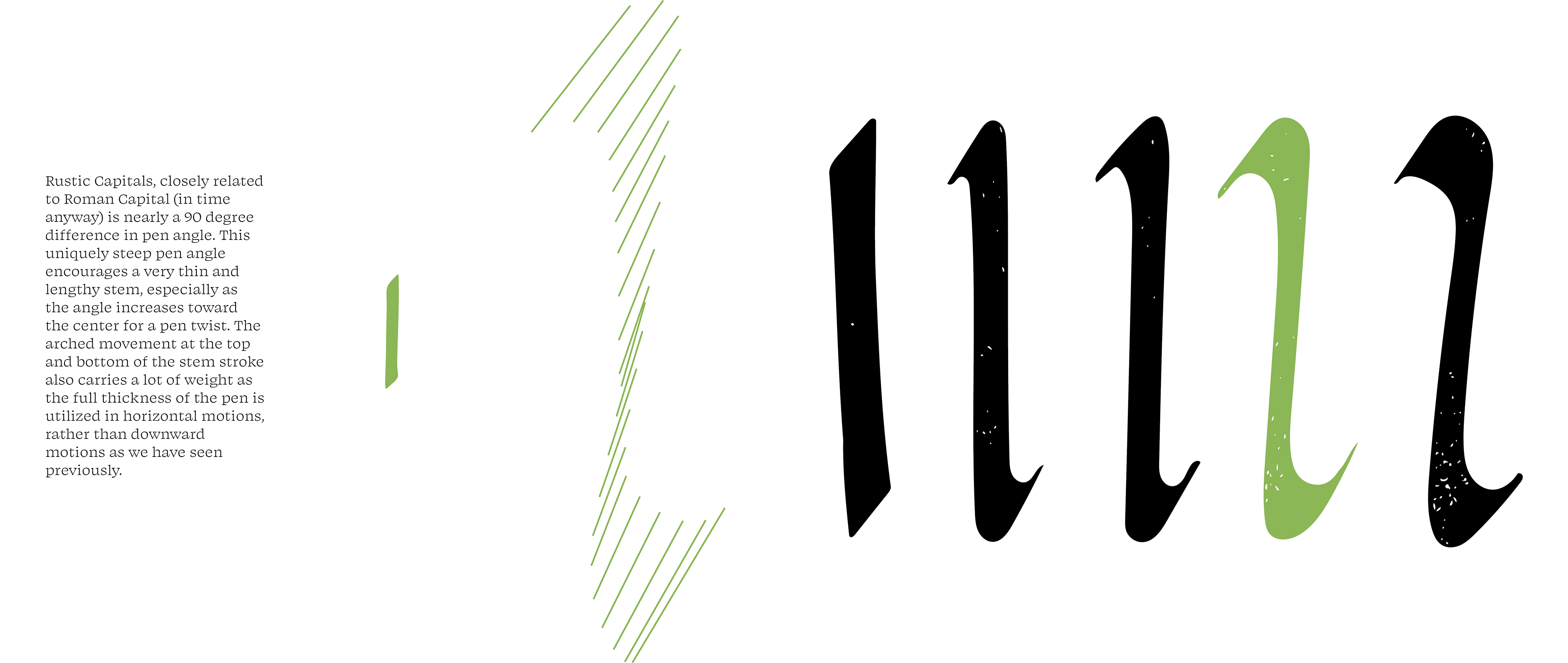
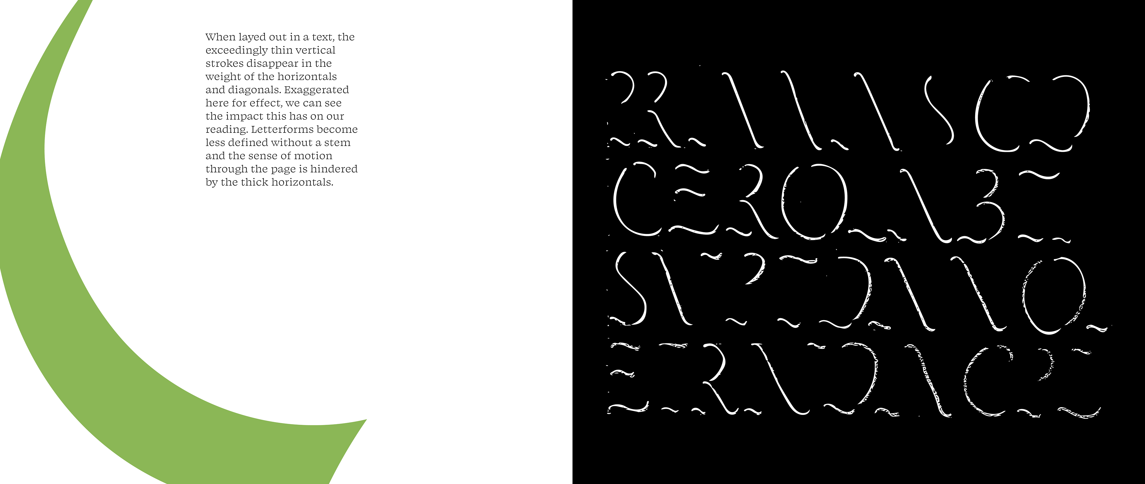
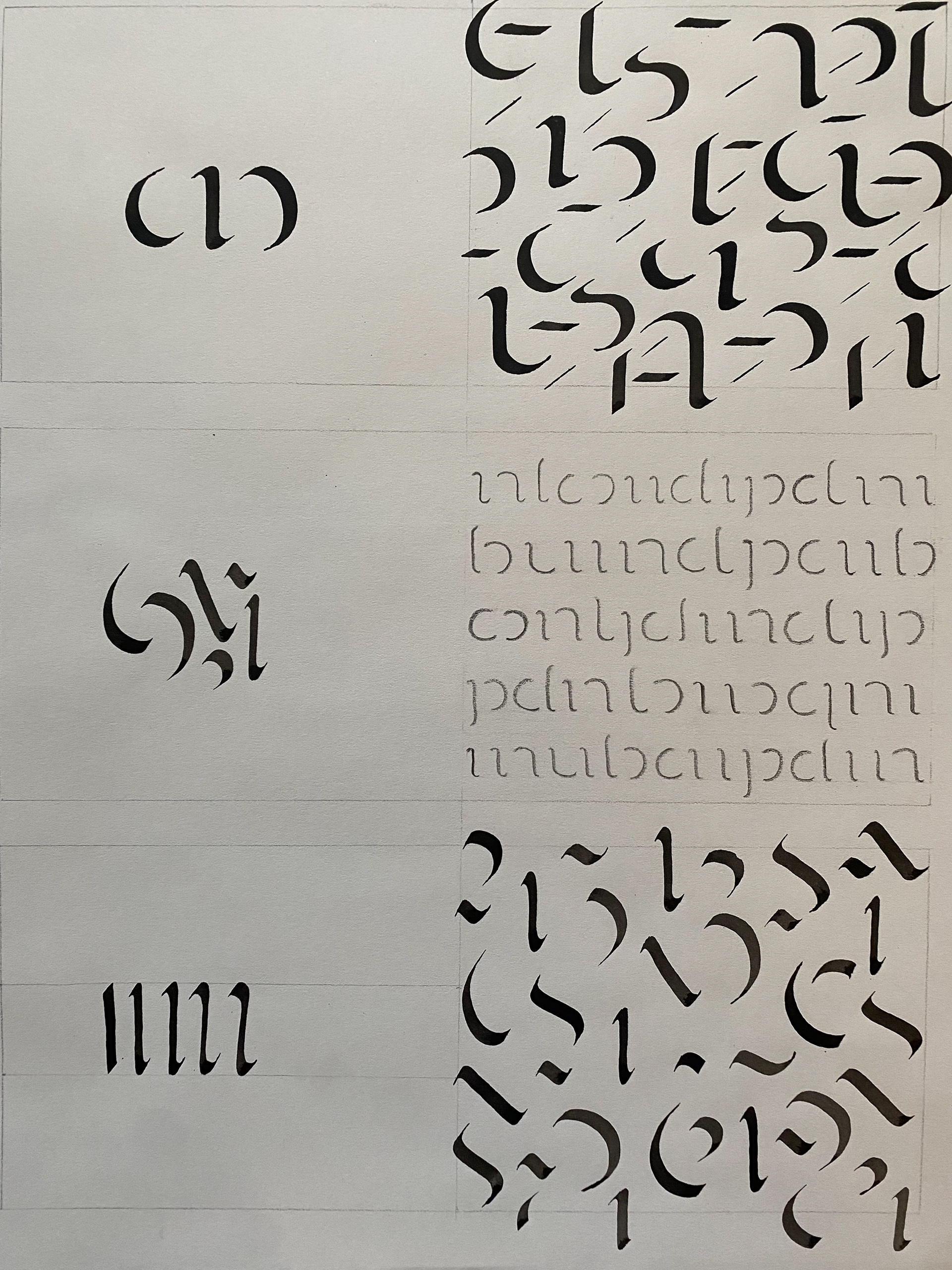
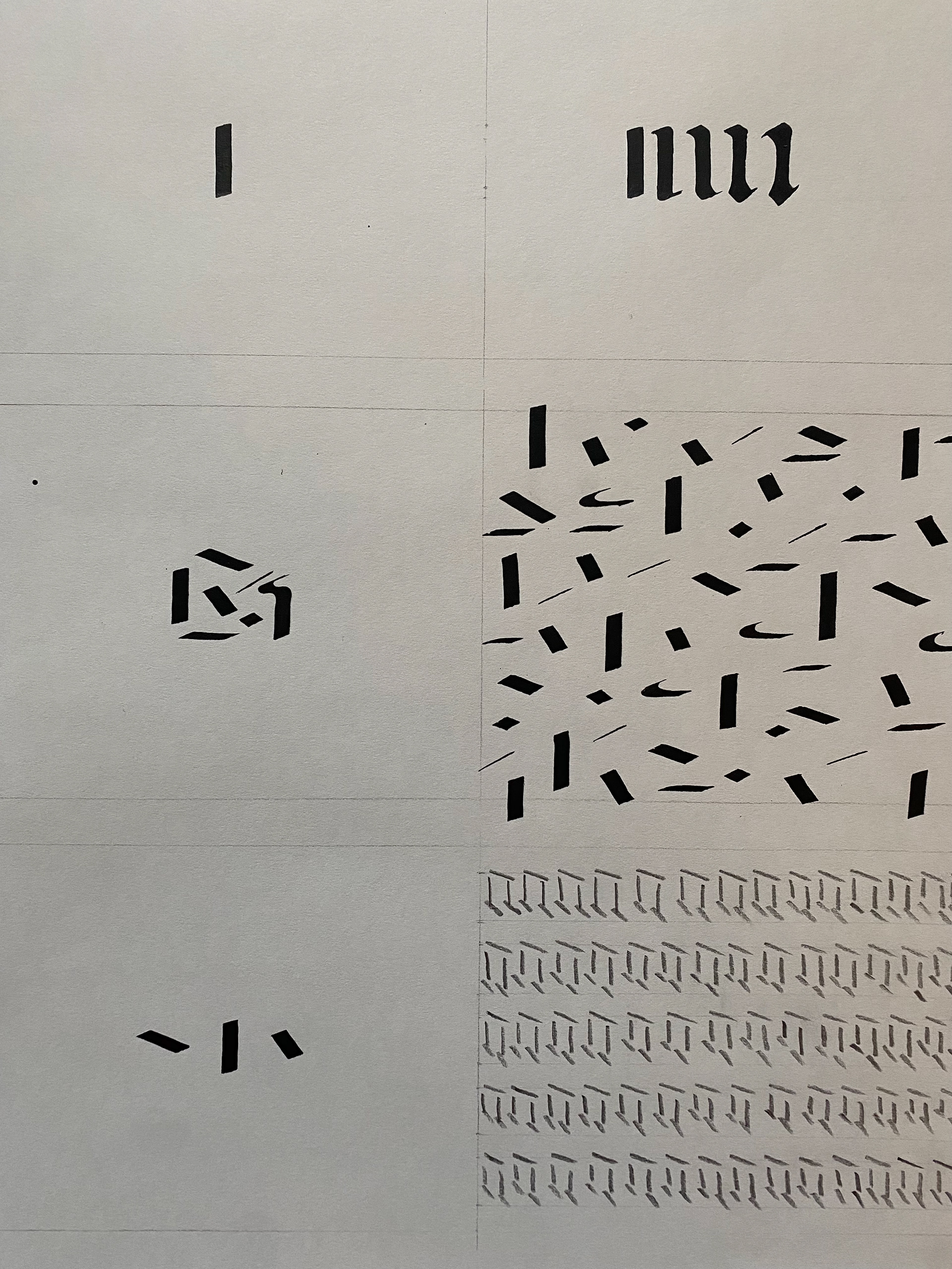
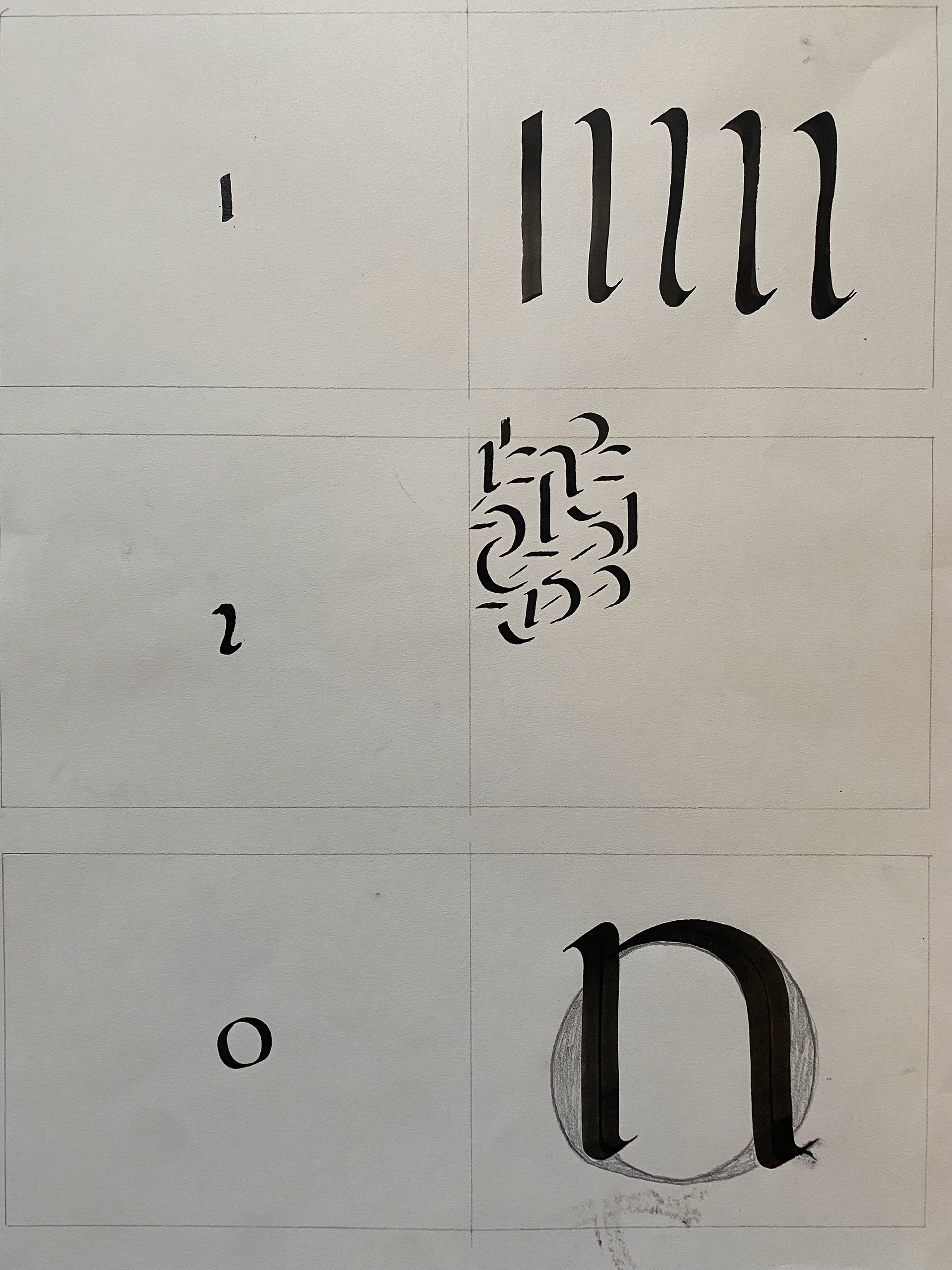
Strokes
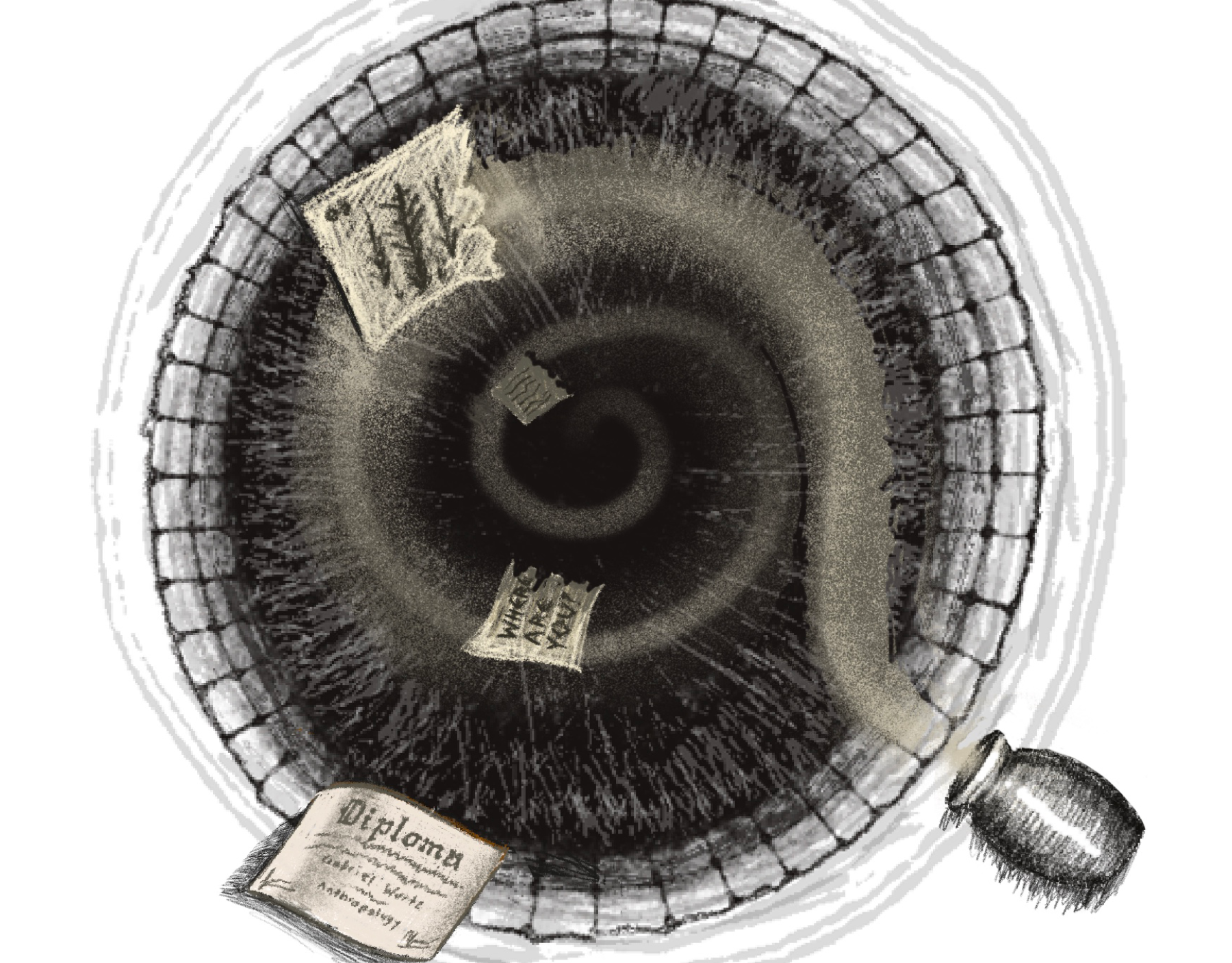
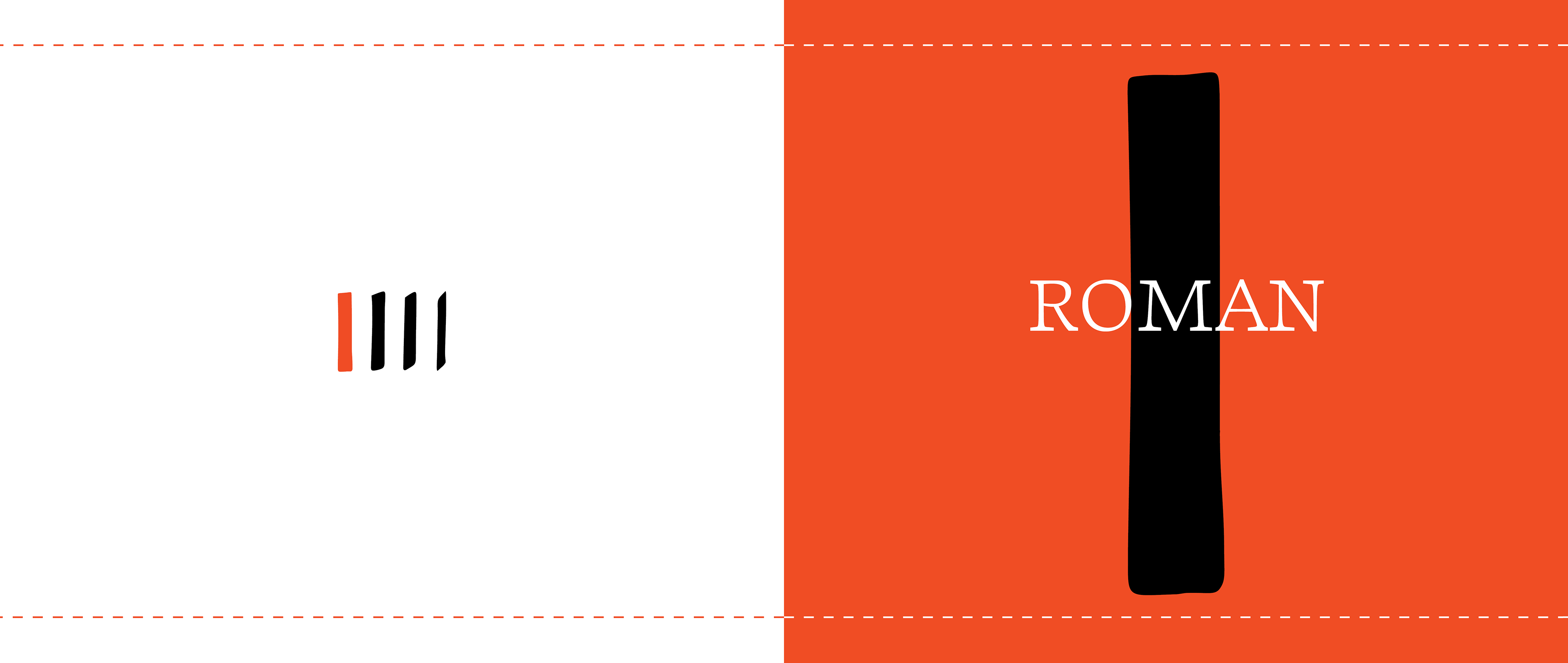
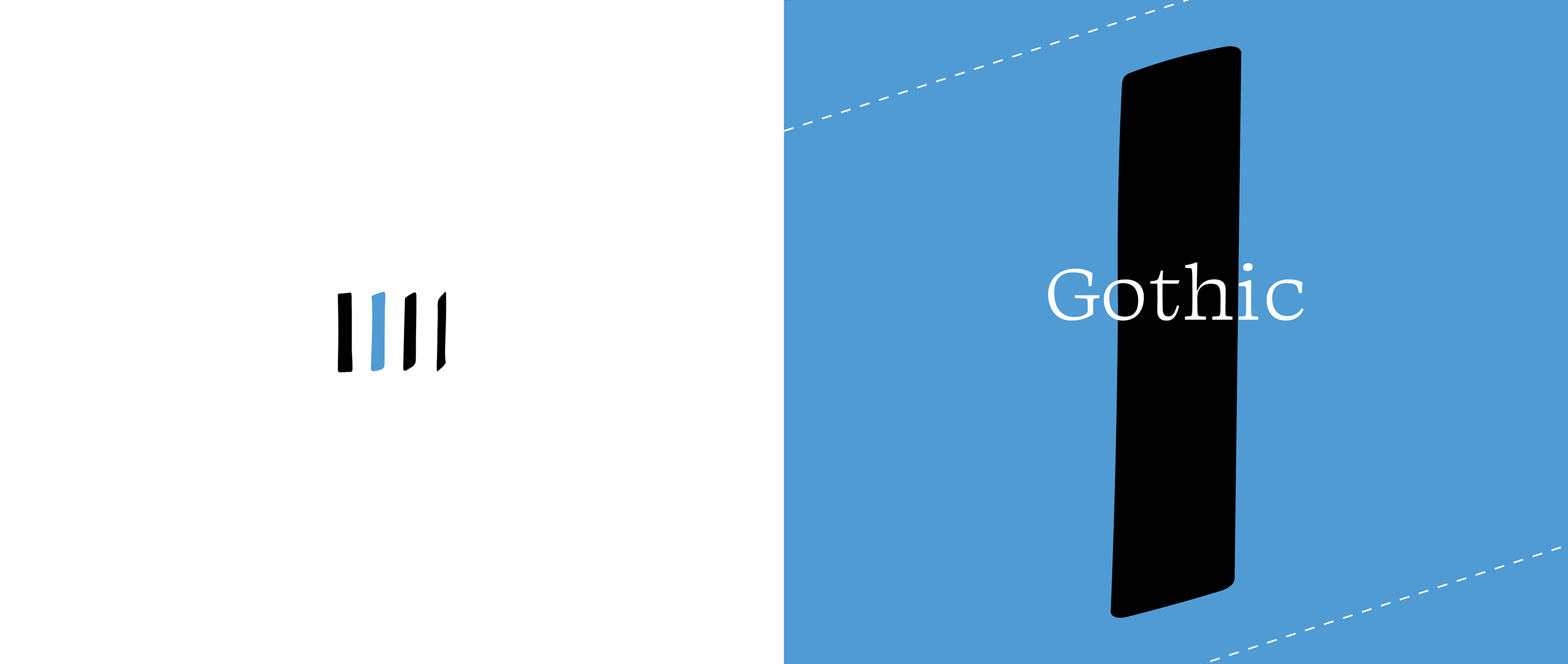
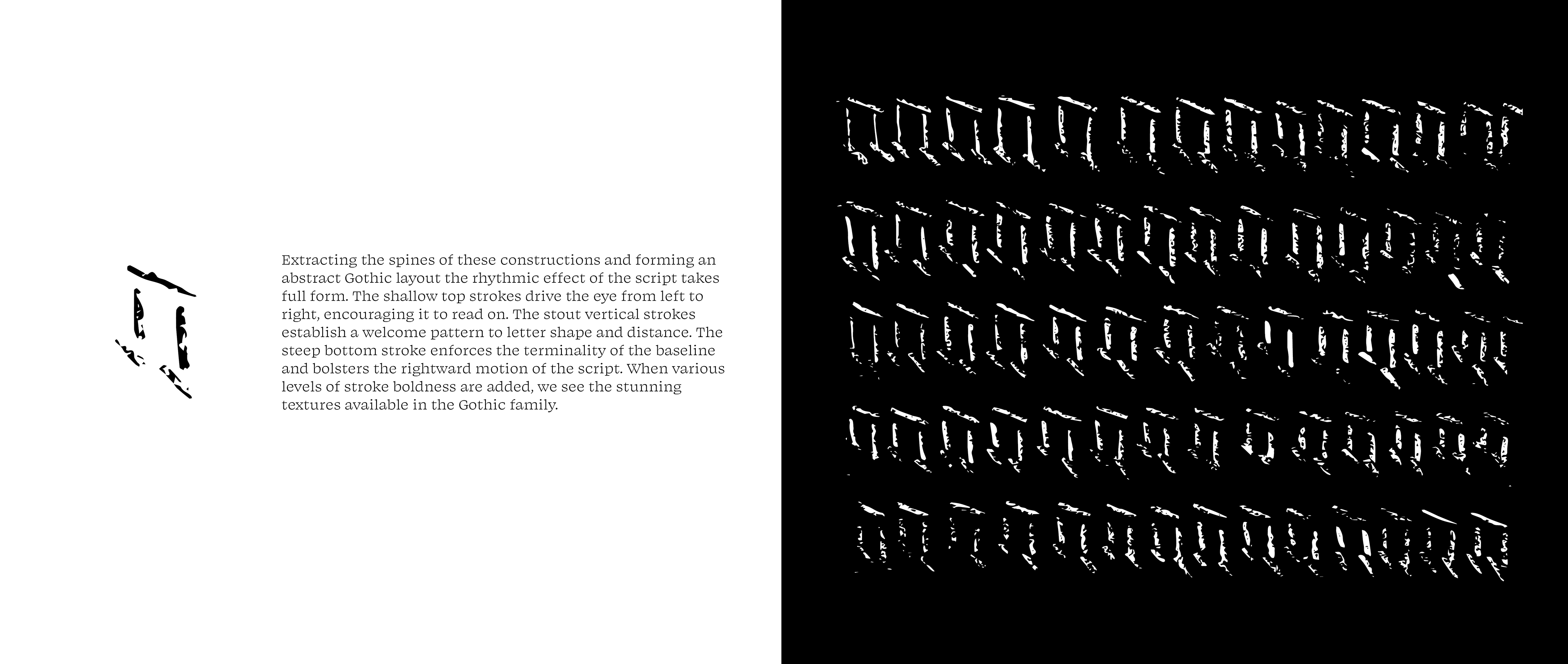
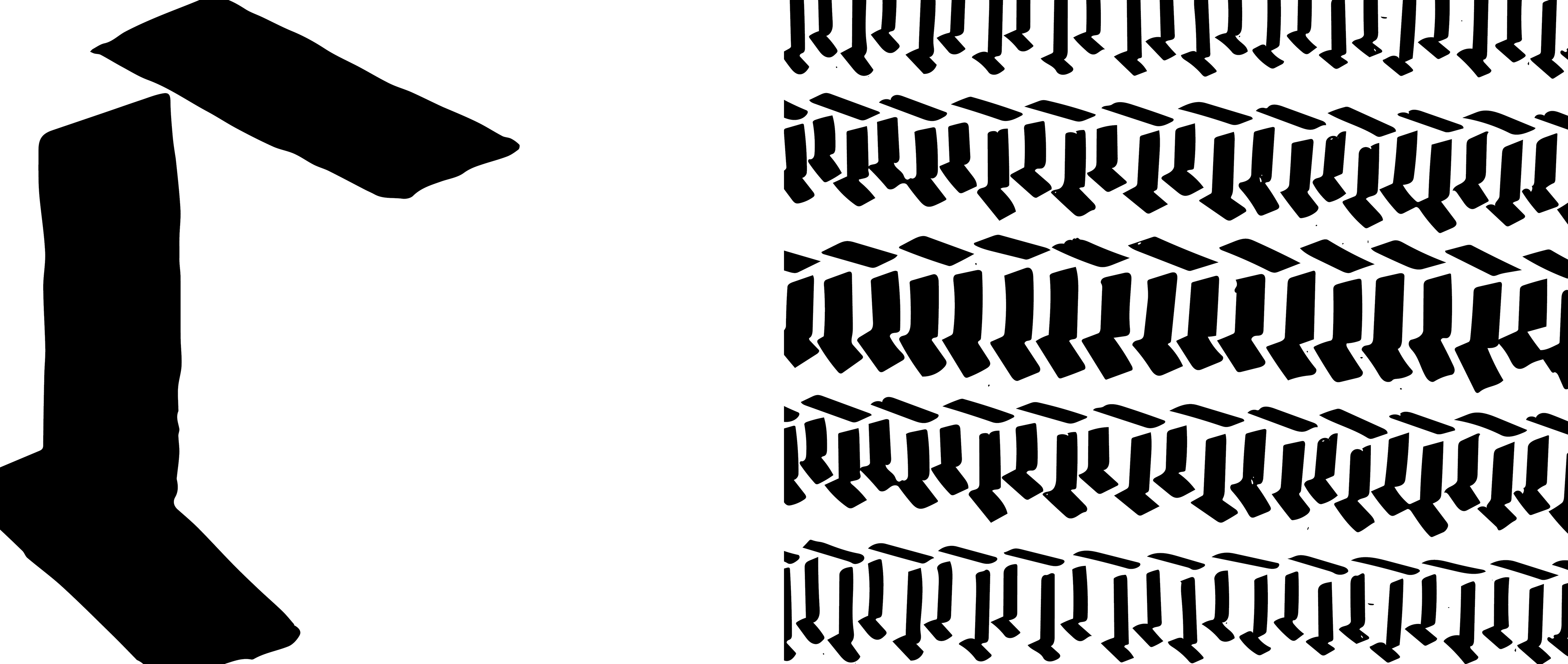
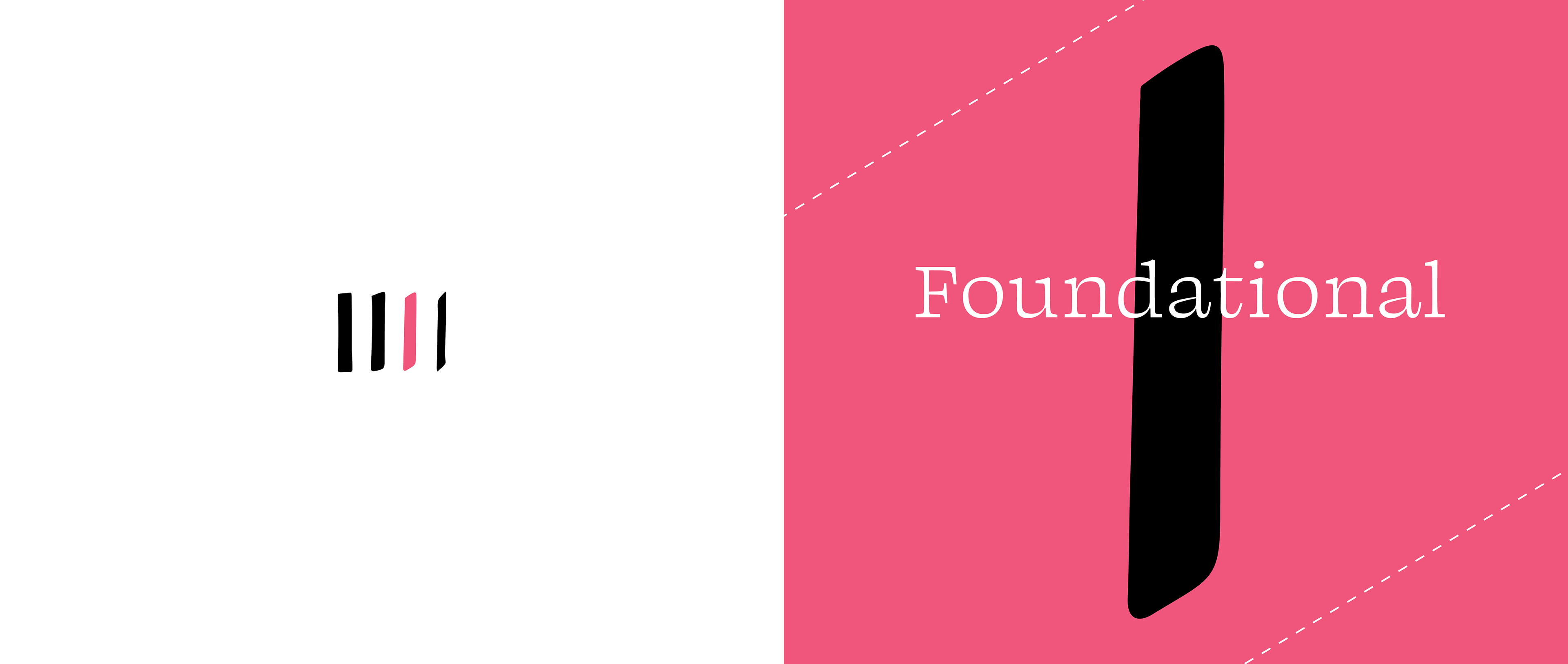
What is the fundamental difference between Latin scripts? How do these differences affect how letters, words, and pages look and our subsequent reading experience? This book seeks to show that pen angle, above all, is the key factor in script changes and development. The double-page spread is utilized to follow and analyze major Latin writing styles through time and to convey the beauty of these movements. This work serves as both an artist's book, showcasing my calligraphic and design work, and as a historic/technical exploration of major calligraphic trends that continue to impact the world of typography and beyond.
Spreads


Process
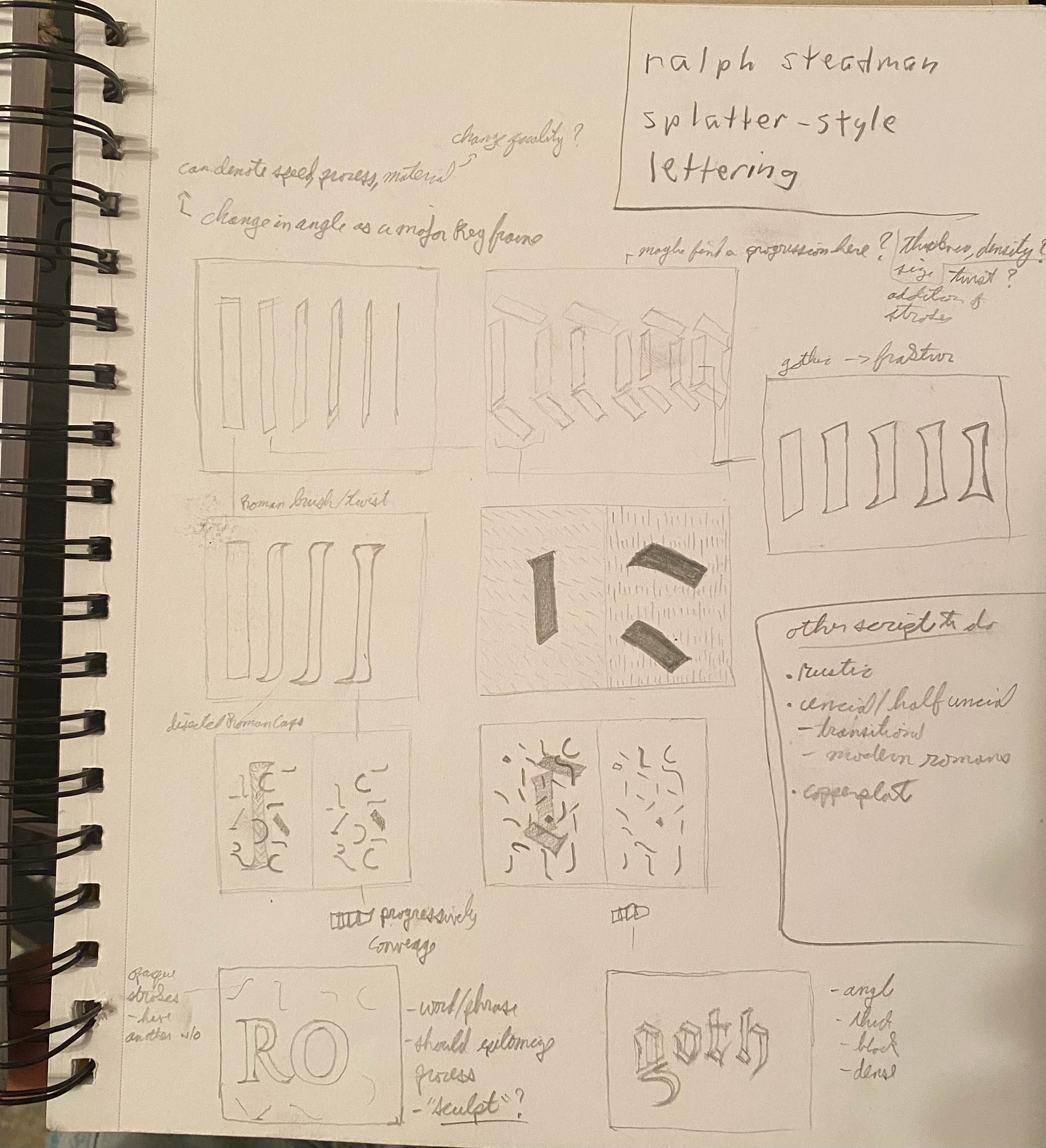
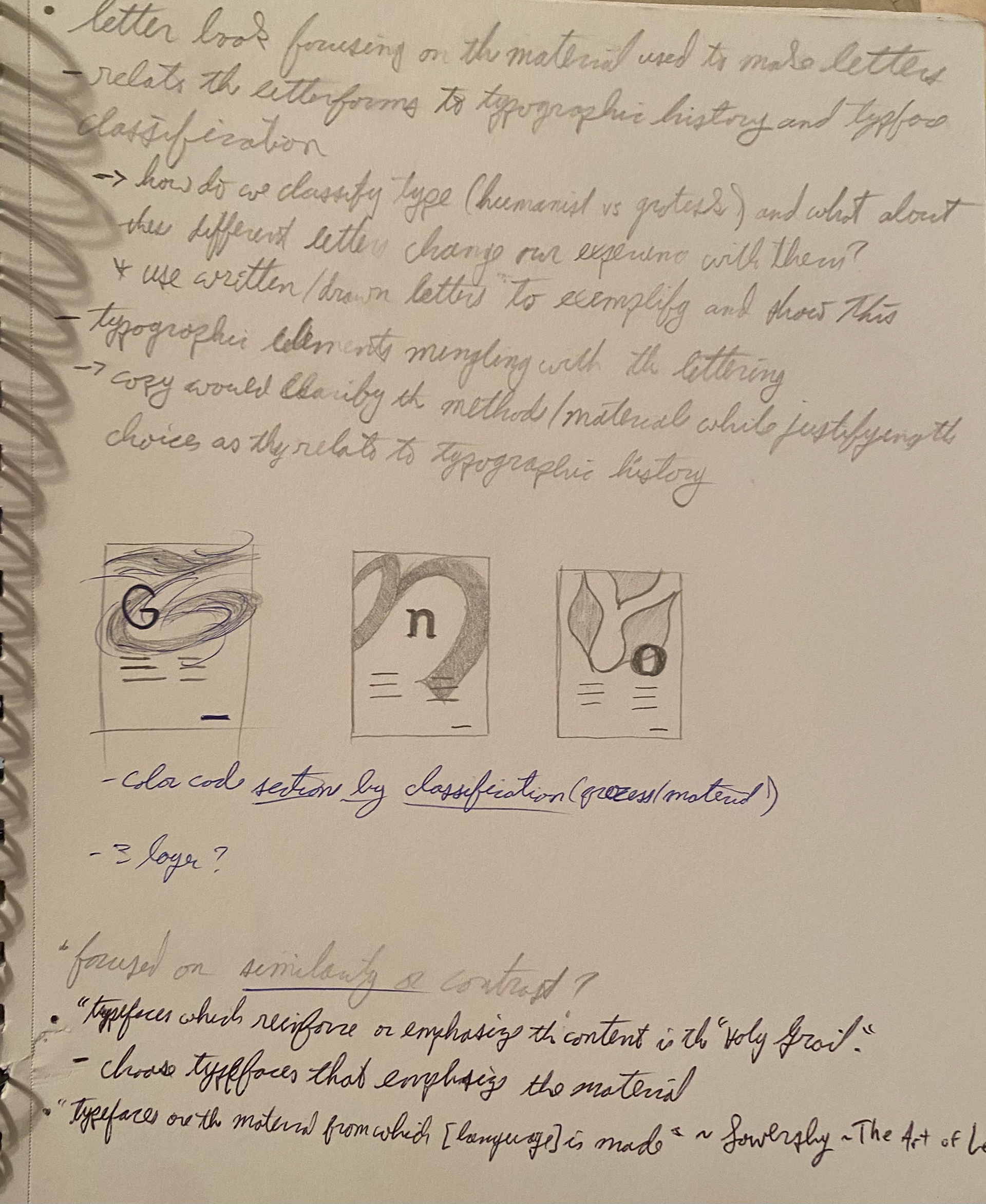
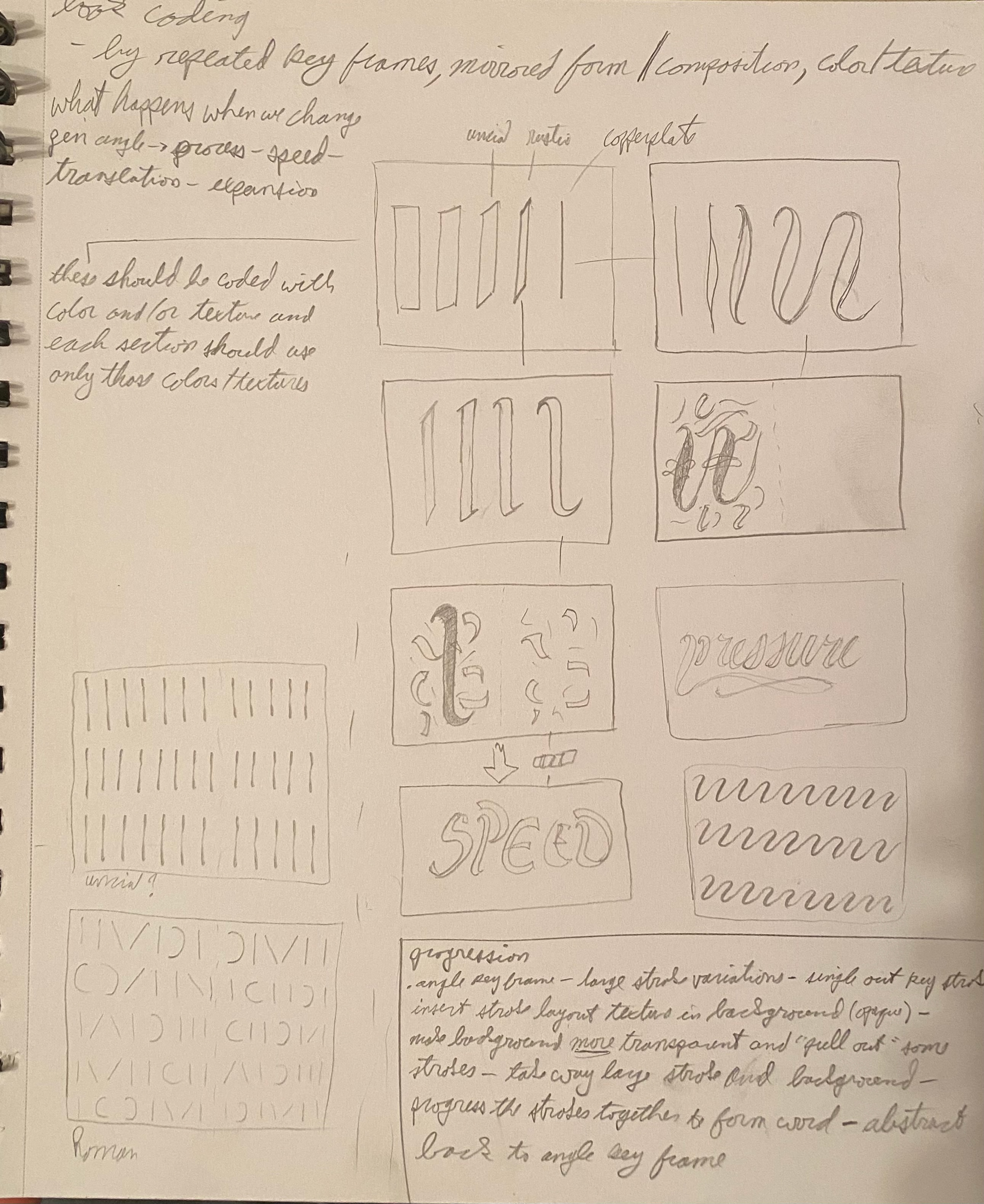
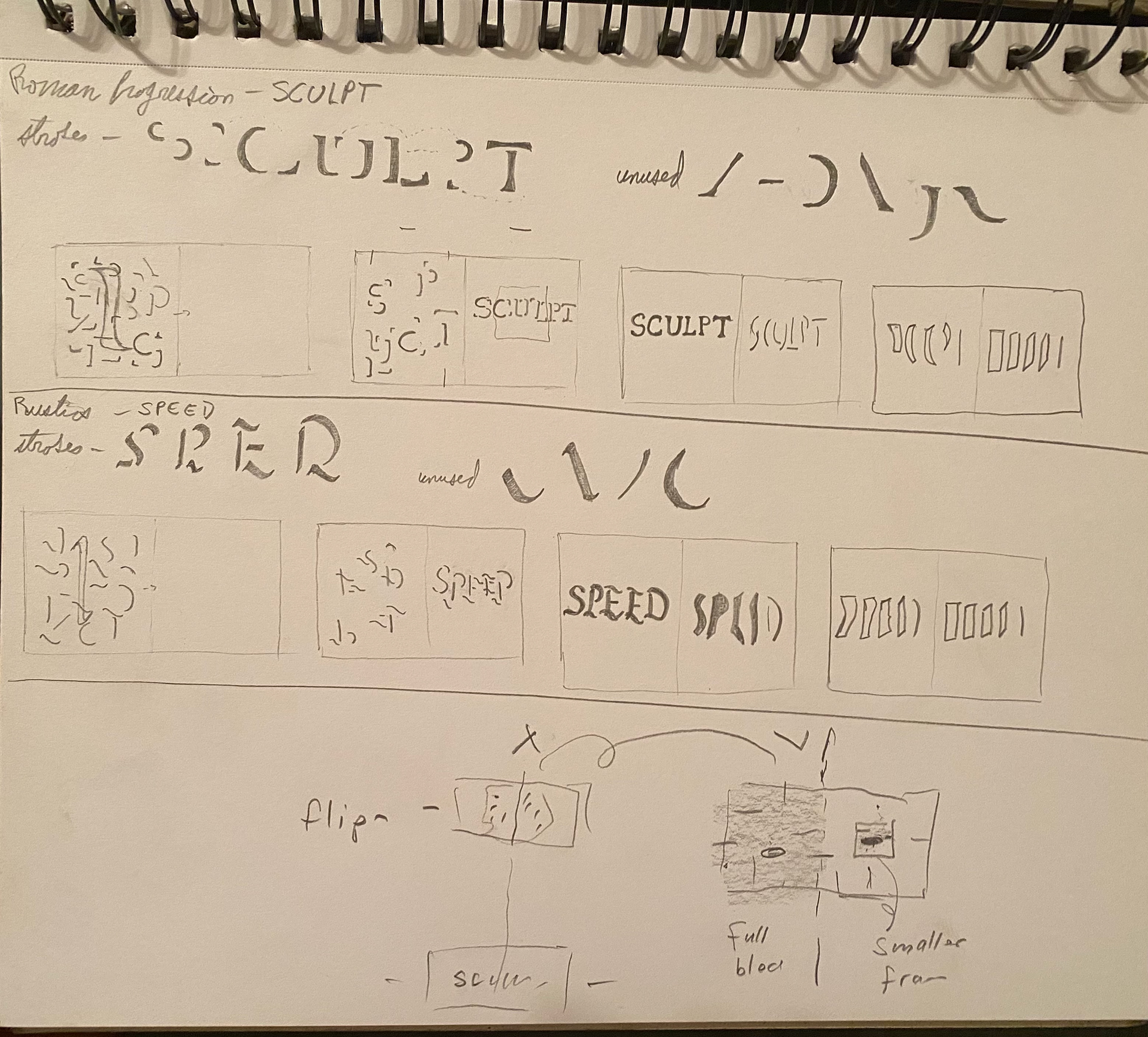

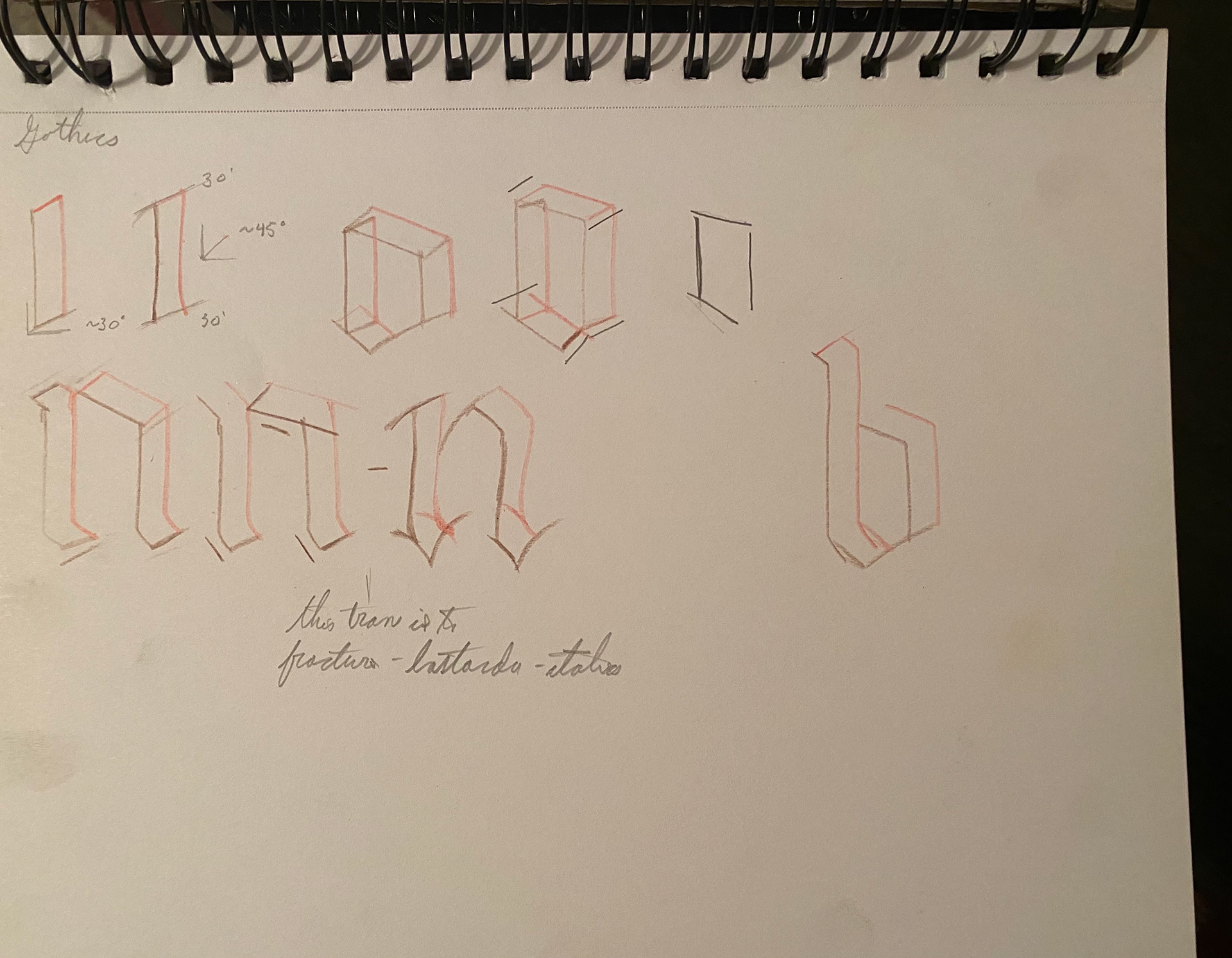
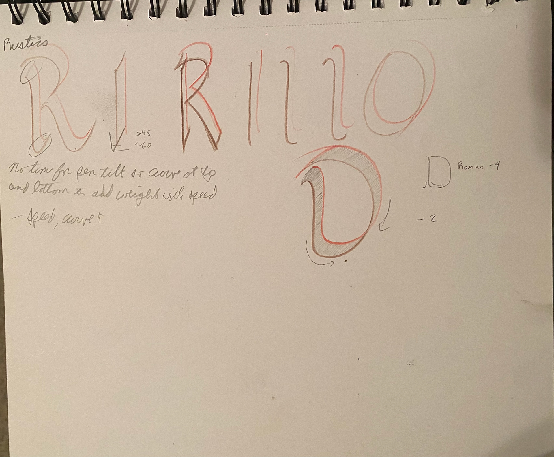
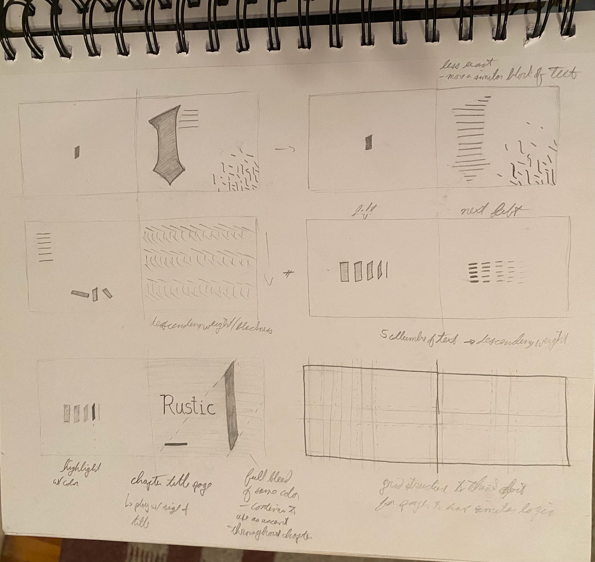


After doing copious research and defining the topic for this project, I began closely studying calligraphic writing angles, pen turns, book layouts, and artists' books of all kinds. Through many series of sketching and thumbnail work, I defined the rules for my double-page spreads and developed a storyboard.
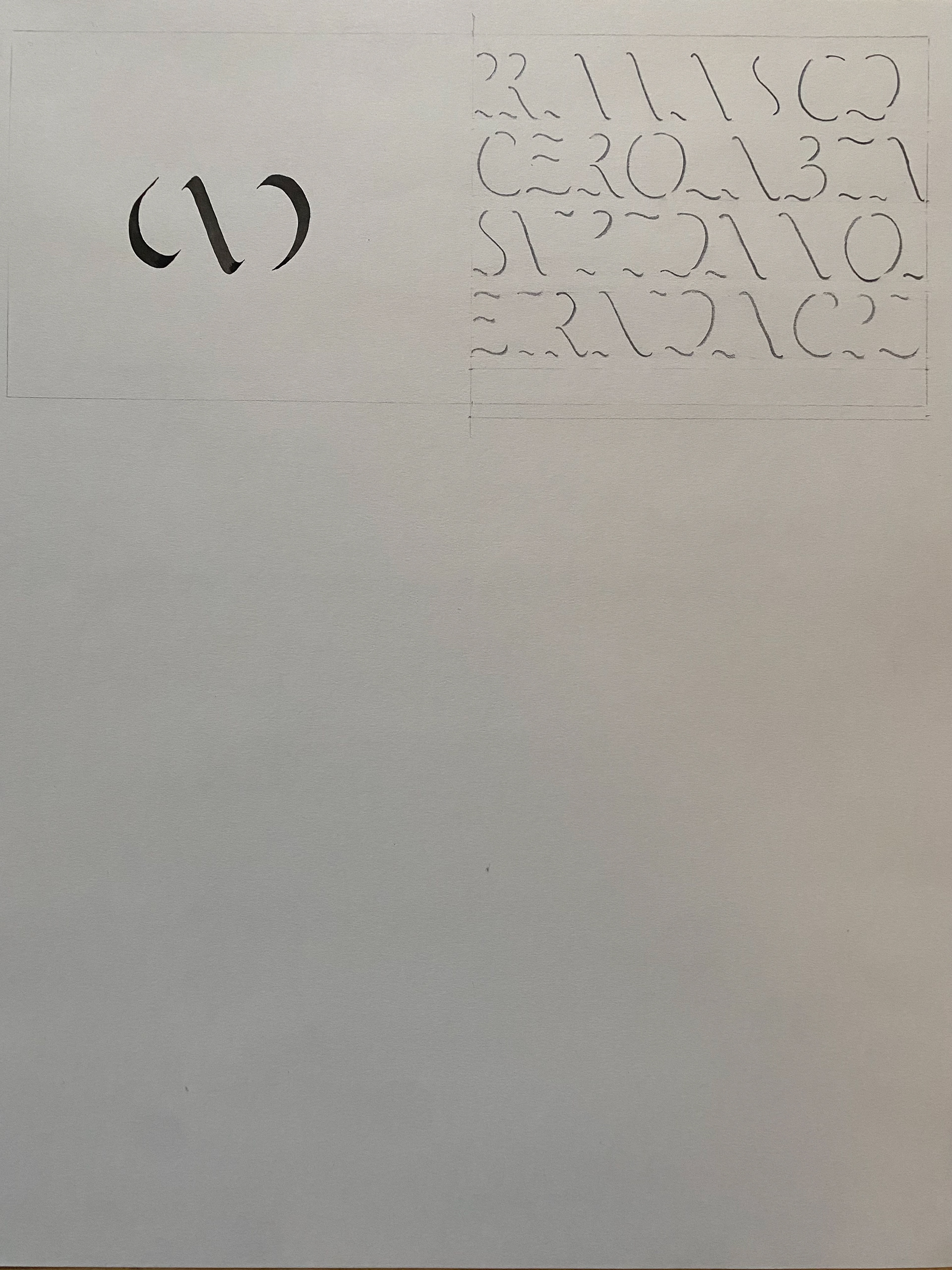
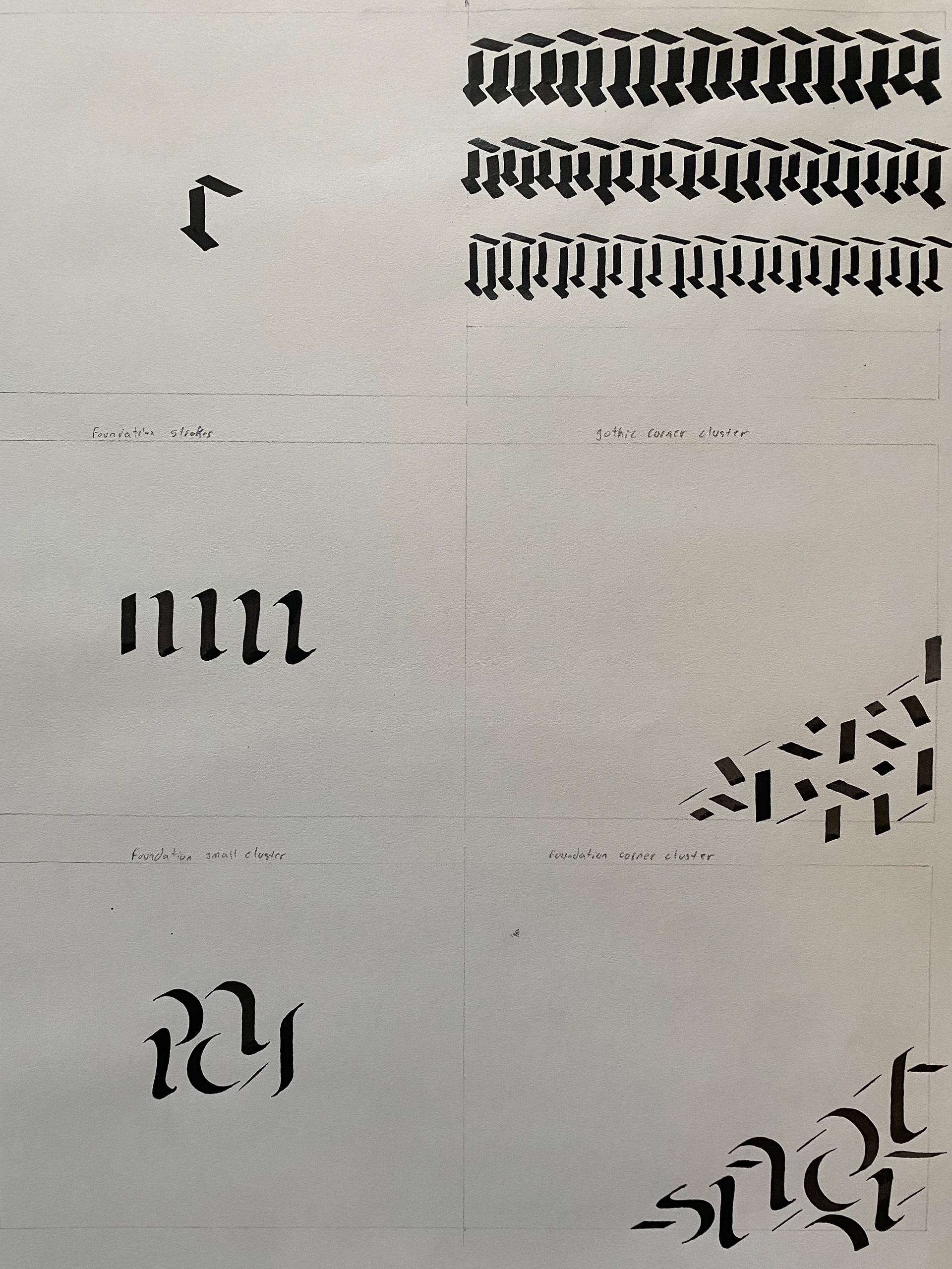
I then executed each required element of calligraphy using Brause broad tip nibs, black ink, and paper. Keeping scale, color, and pen thickness consistent throughout this process was key to ensure the only changes the reader sees are a result of an angle change.
Adobe Capture proved to be the best way to digitize the physical calligraphy. It quickly created vector files of the strokes, kept the integrity/sharpness of the lines, and added a much-appreciated texture when desired. Through some refining of the strokes in Illustrator, the end product was a natural, and honest transcription of my original calligraphy. I then laid out these elements with text and other supporting elements, desiring a dramatic and eye-catching space.
Details
50 pages | 13x11 in | 100+ unique elements | 150 hours
Medium: calligraphy (pen and ink), digitizing (Adobe Capture, AI), shape manipulation/creation (AI), layout and typesetting (ID)
Mentor: Gokhan Ersan