Energy Infographics
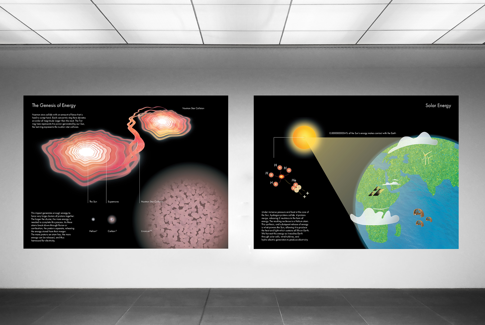
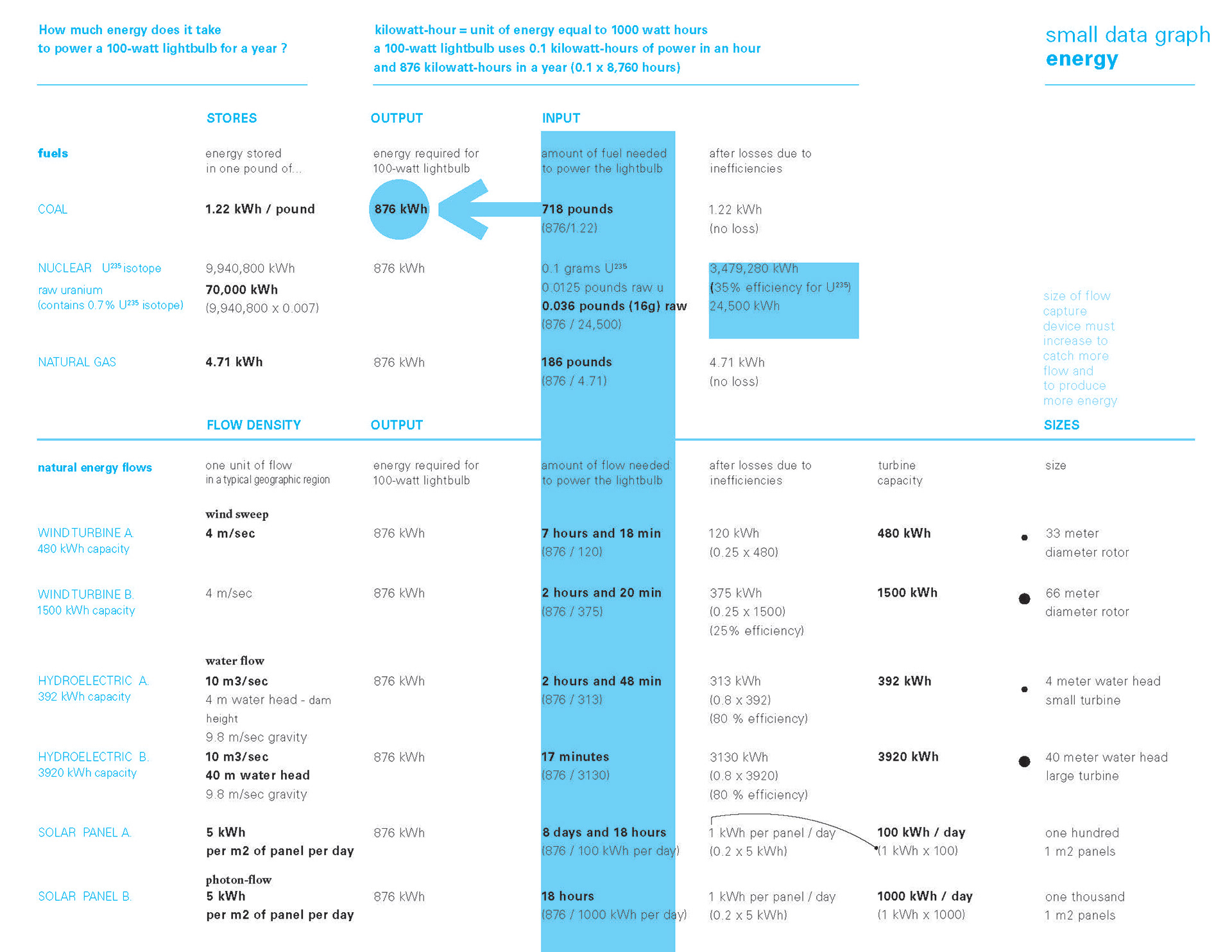
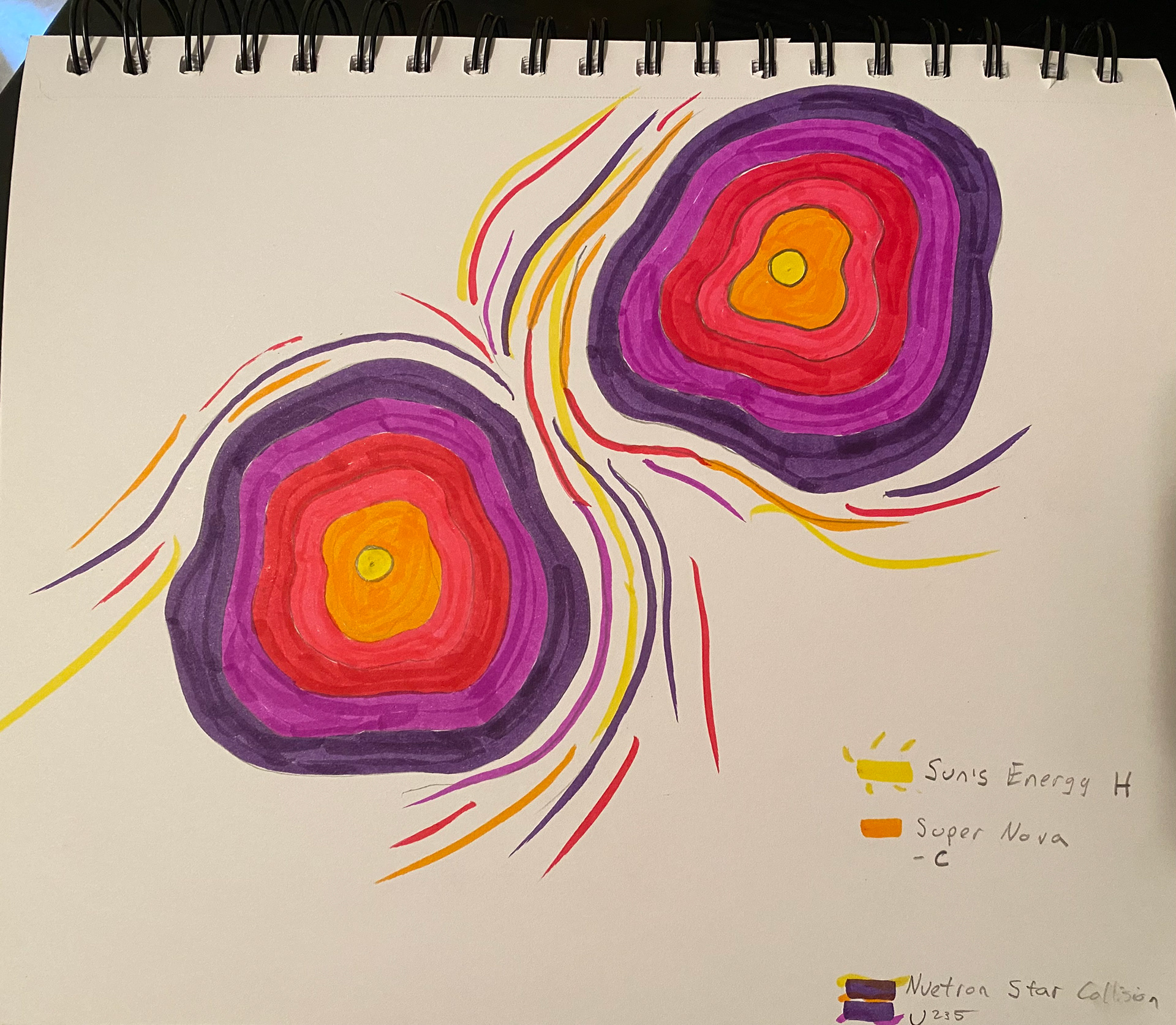
Picturing numbers is an integral challenge for any designer. How do we clearly communicate complex data while maintaining aesthetic intrigue? For this project, a group of designers was given a datasheet detailing energy output (kWh) per pound of fuel. The challenge was to translate this information to illustrate the energy potential of the fuels: coal, natural gas, and uranium, as well as solar, wind, and hydroelectric energy. While some designers chose to show the work that could be done with each energy output, my solution got to the root of why some materials have a greater energy potential. Research into astrophysics, nuclear synthesis, and nuclear fission was necessary to properly tell this story that is really one of energy input and storage.


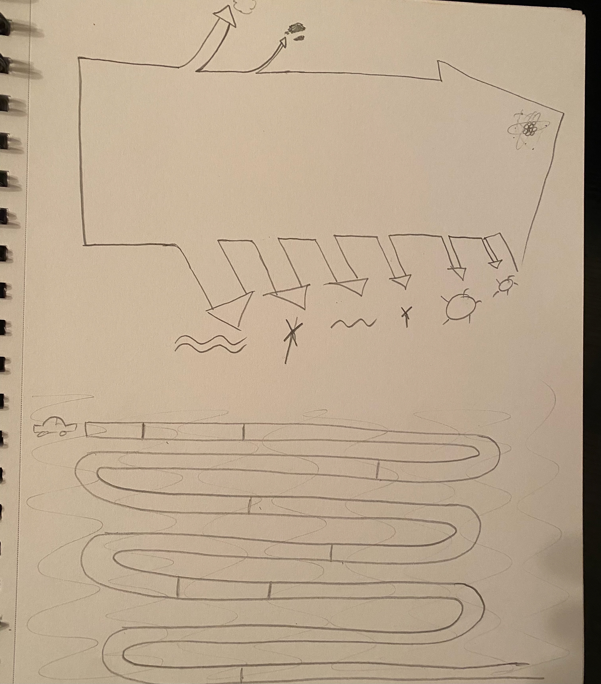
Process
Details


40x30in | 2 posters | 50 hours
Medium: shape creation and layout (AI), textures (PS)
Mentor: Gokhan Ersan