Binghamton East Gym Wayfinding
The Binghamton East Gym is a place for all those involved with the college to engage in physical activity. We know that exercise is beneficial for both physical and mental health, but the type of exercise does not matter so much. Thus, it is left up to the participant to decide. As such, the East Gym offers many forms of exercise: weight training, cardio machines, yoga, spin classes, outdoor pursuits, basketball, swimming, and many more. With so many opportunities offered it is integral to have an efficient system in place so all those who enter the gym know of these opportunities, their cost, and where to find them.
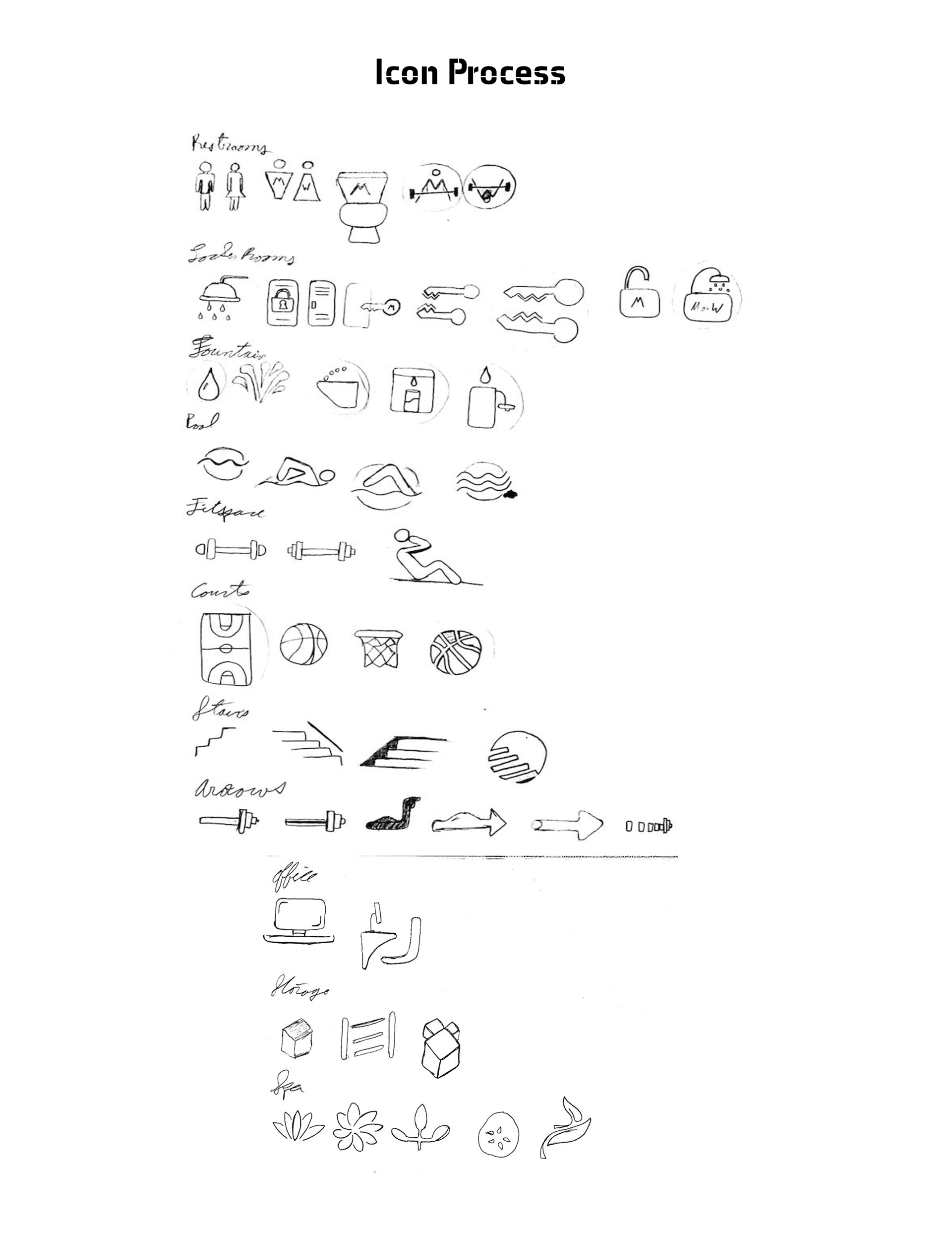
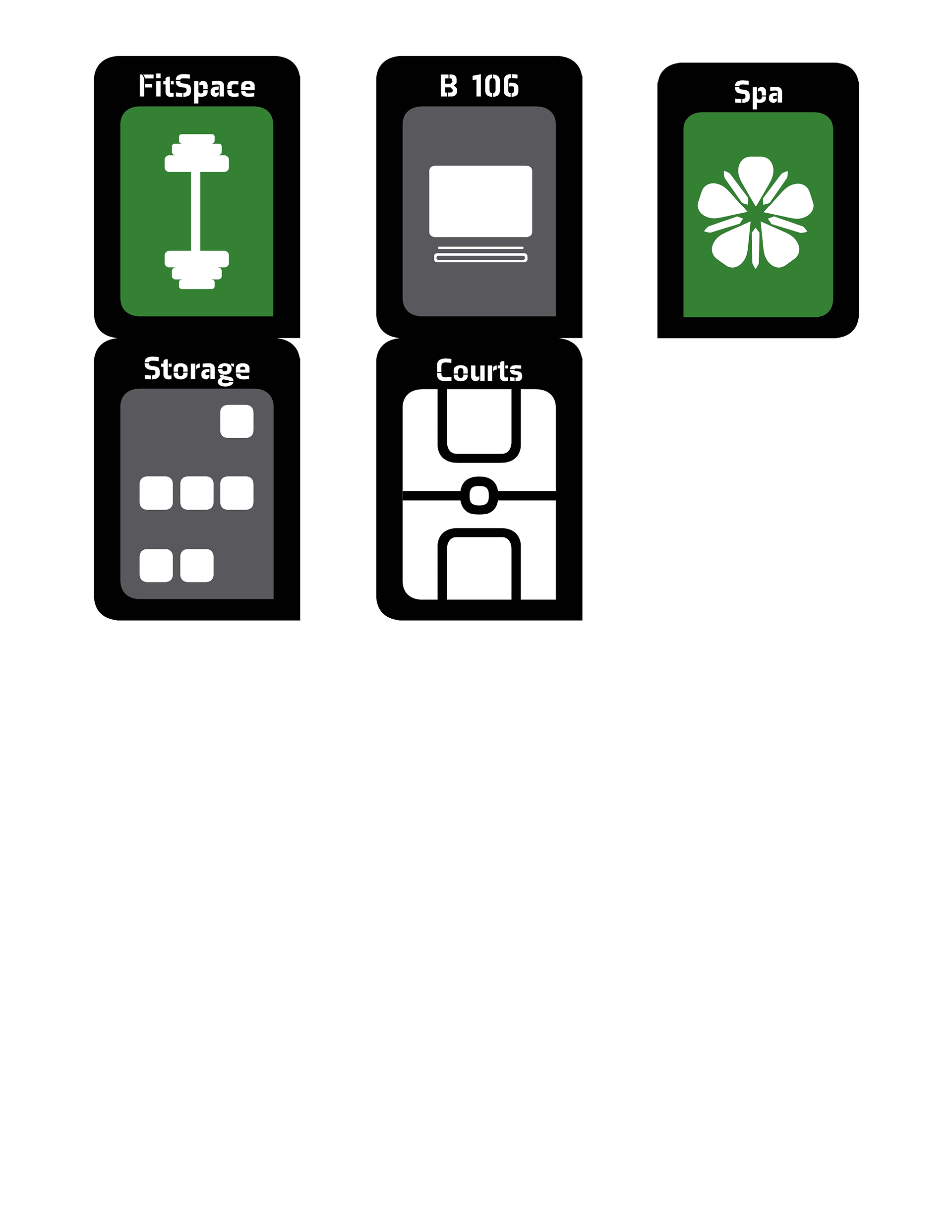
Icons
Description
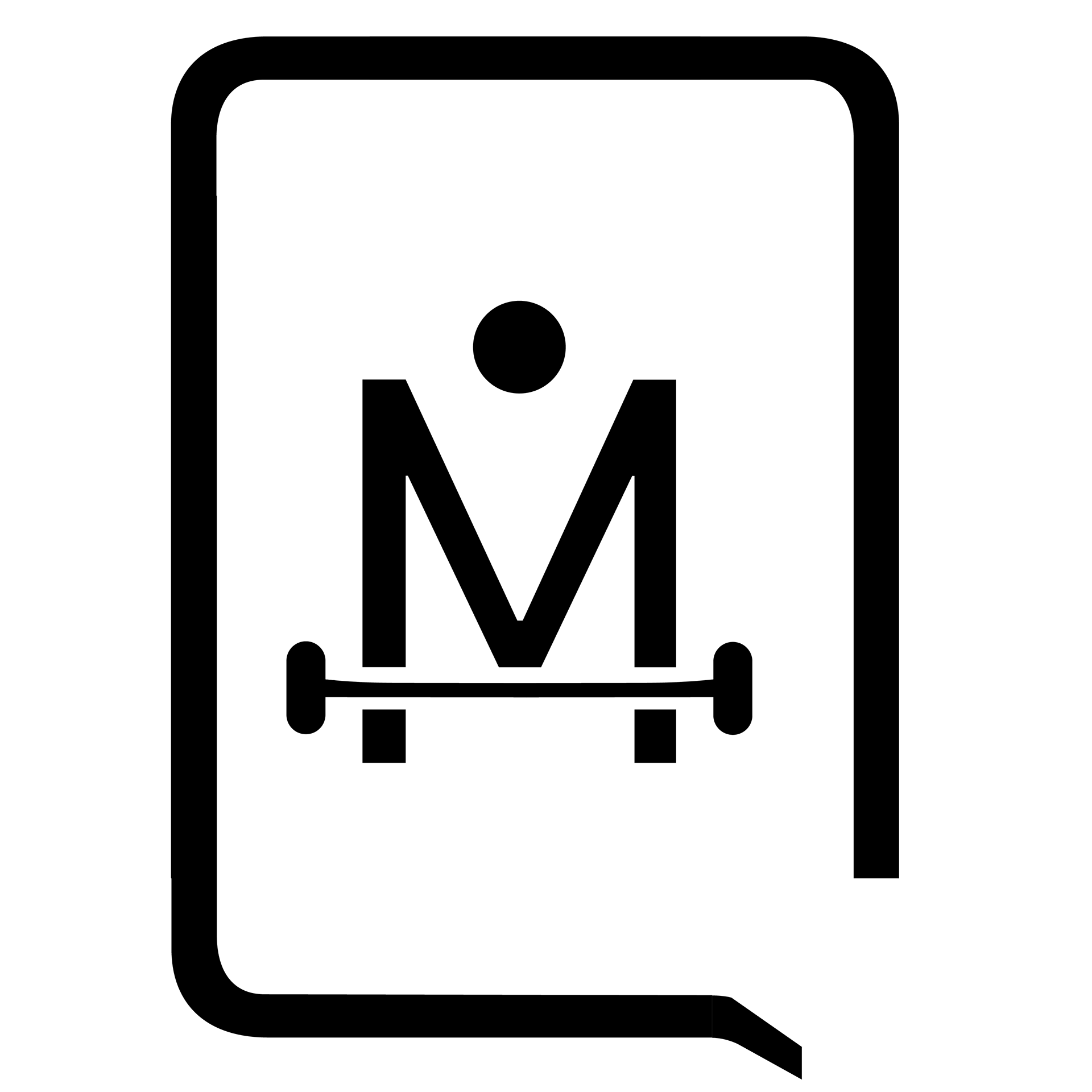

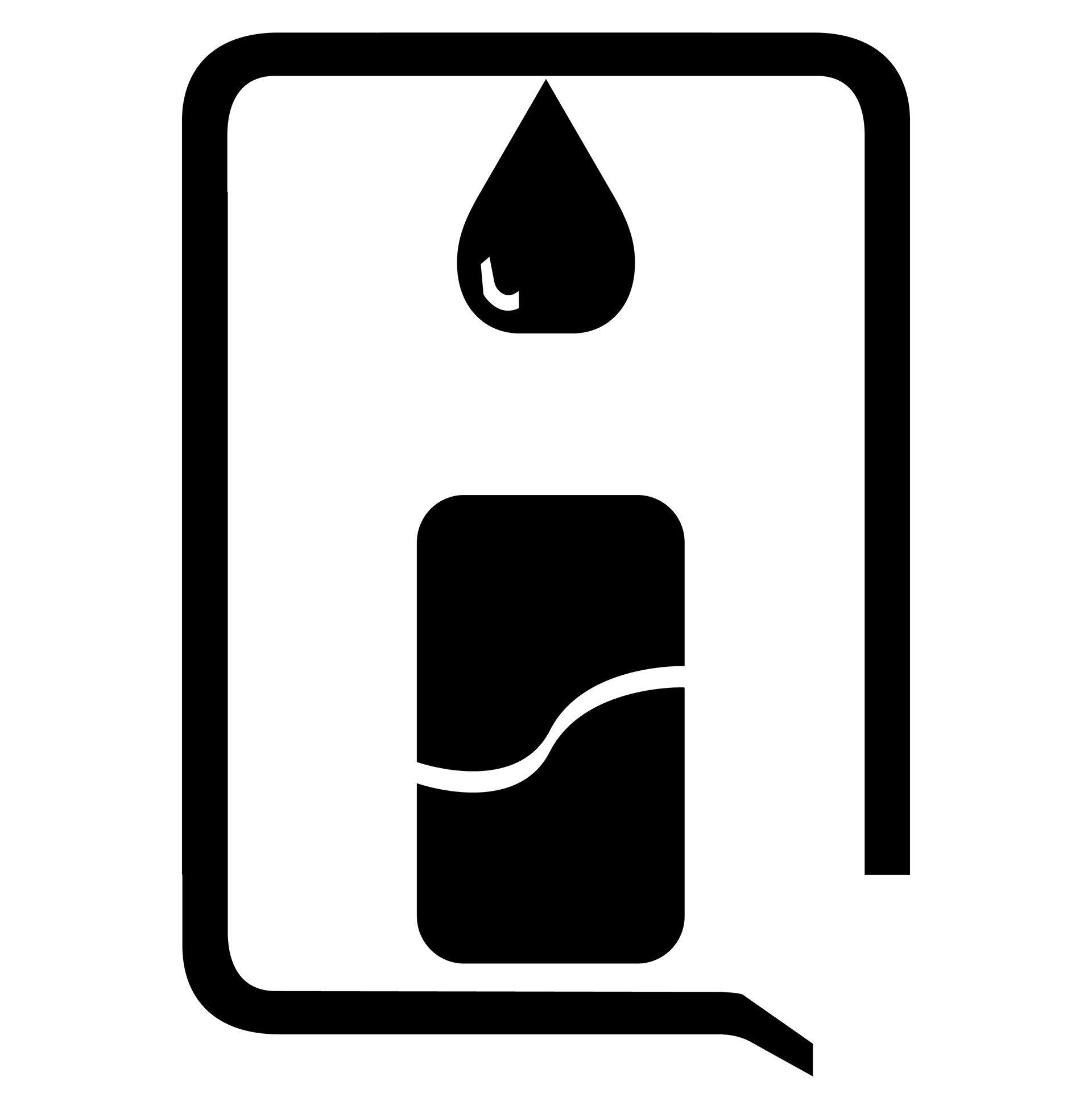

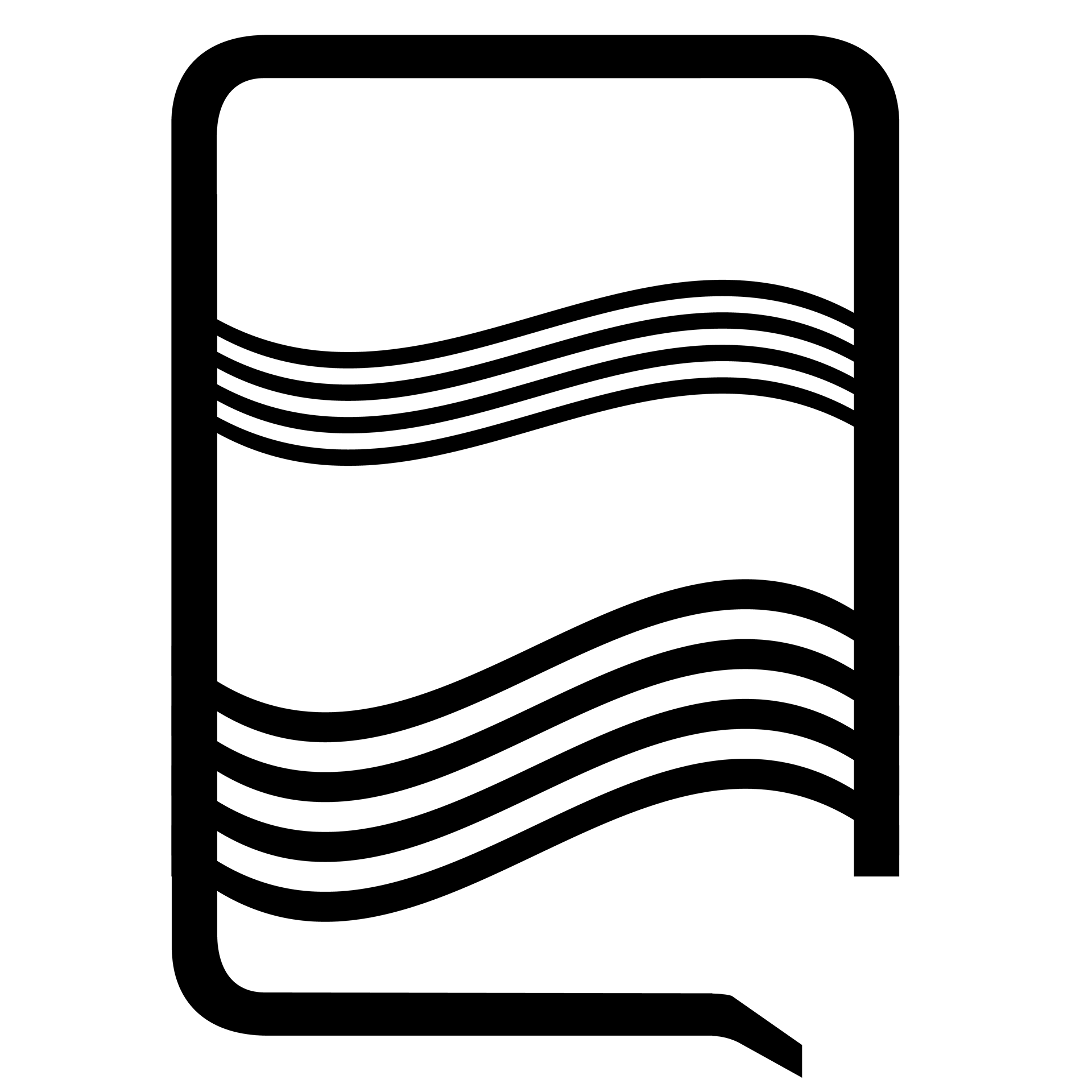


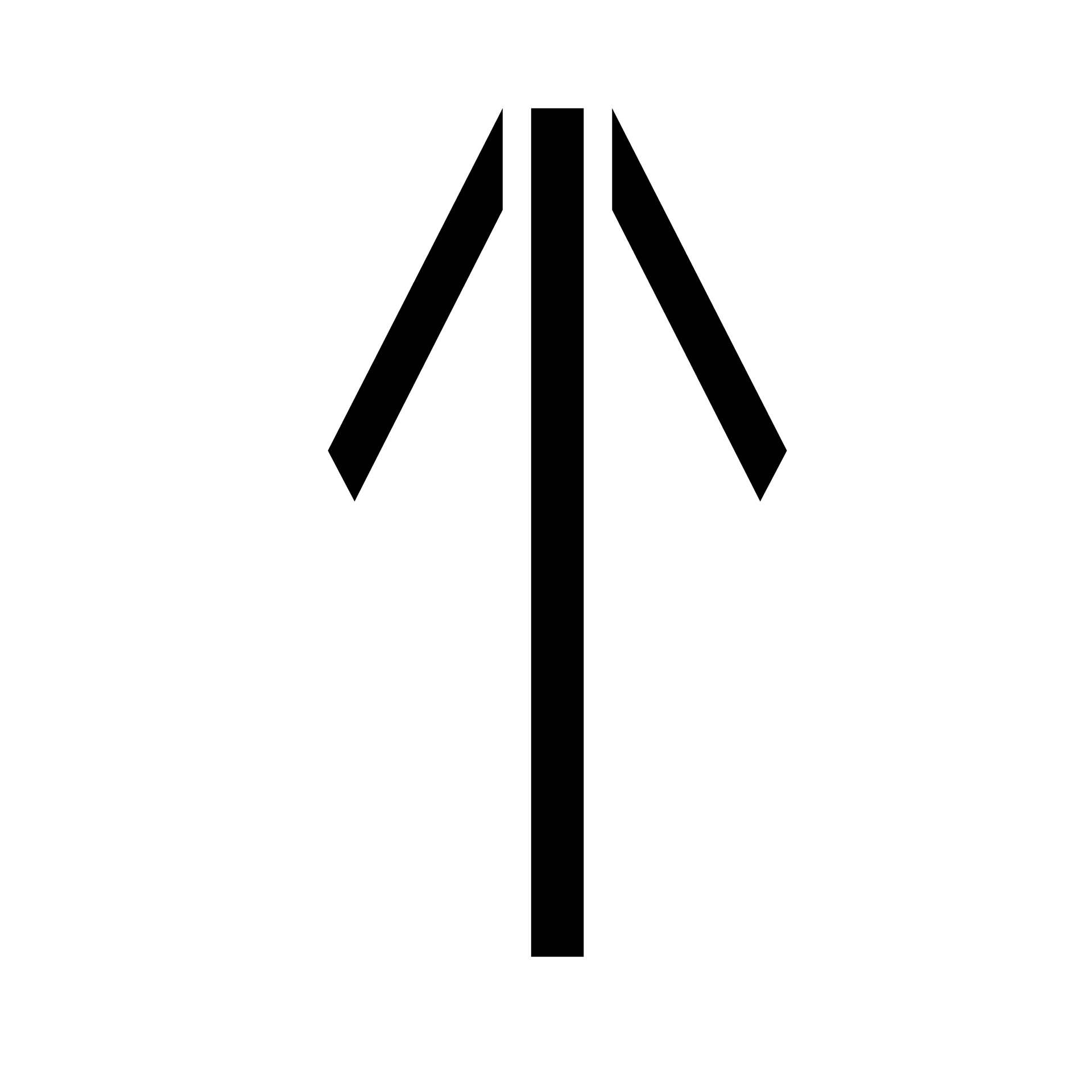

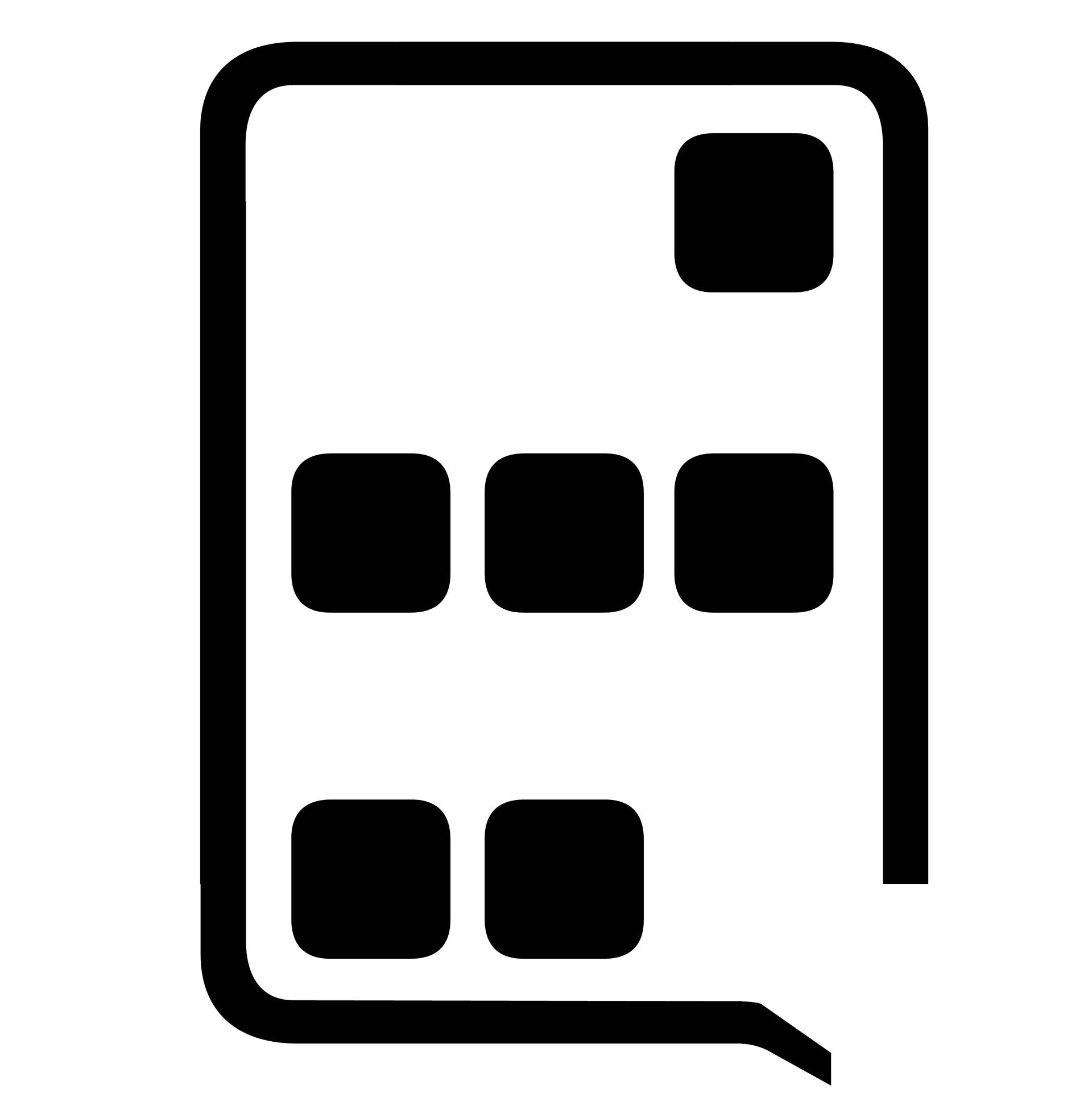
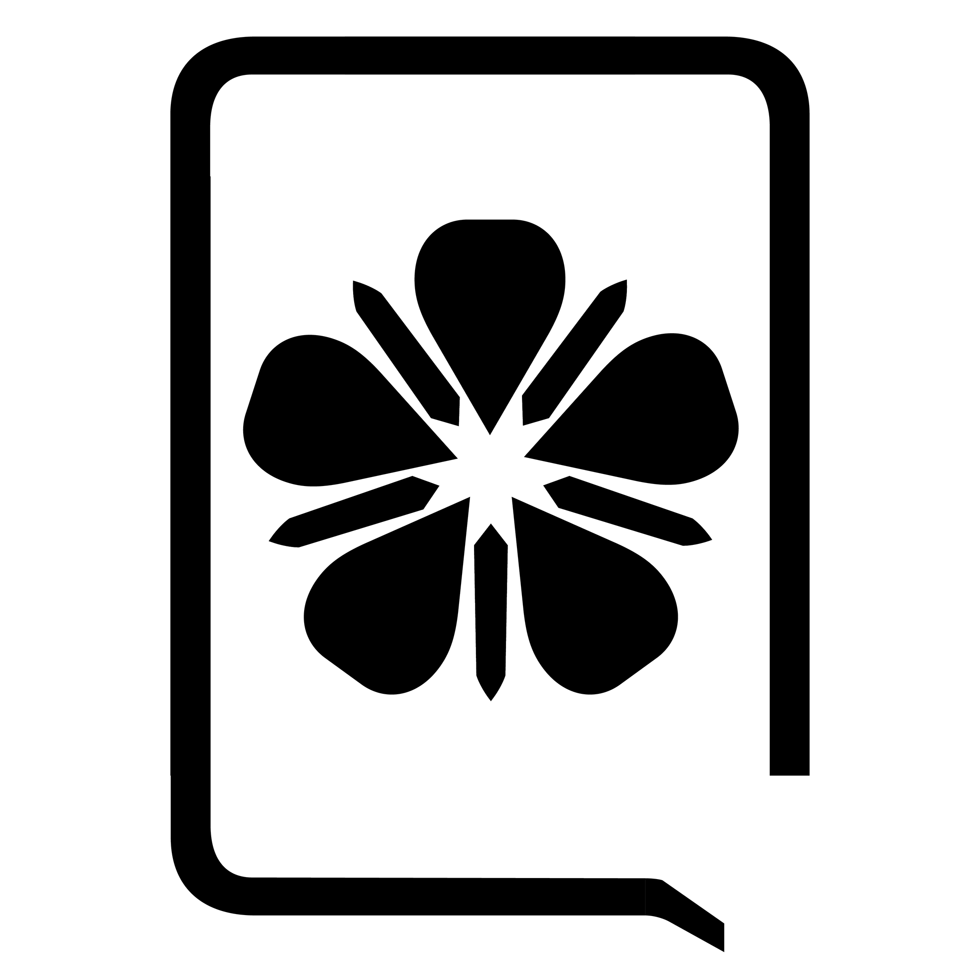

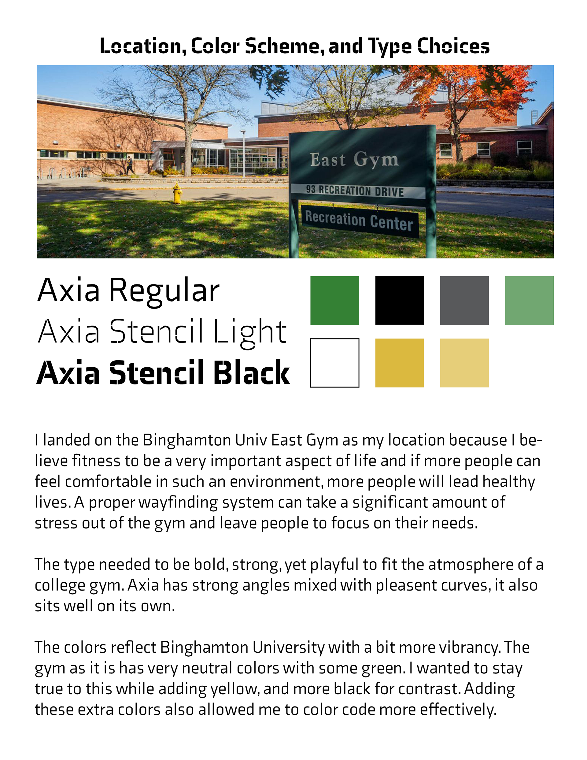
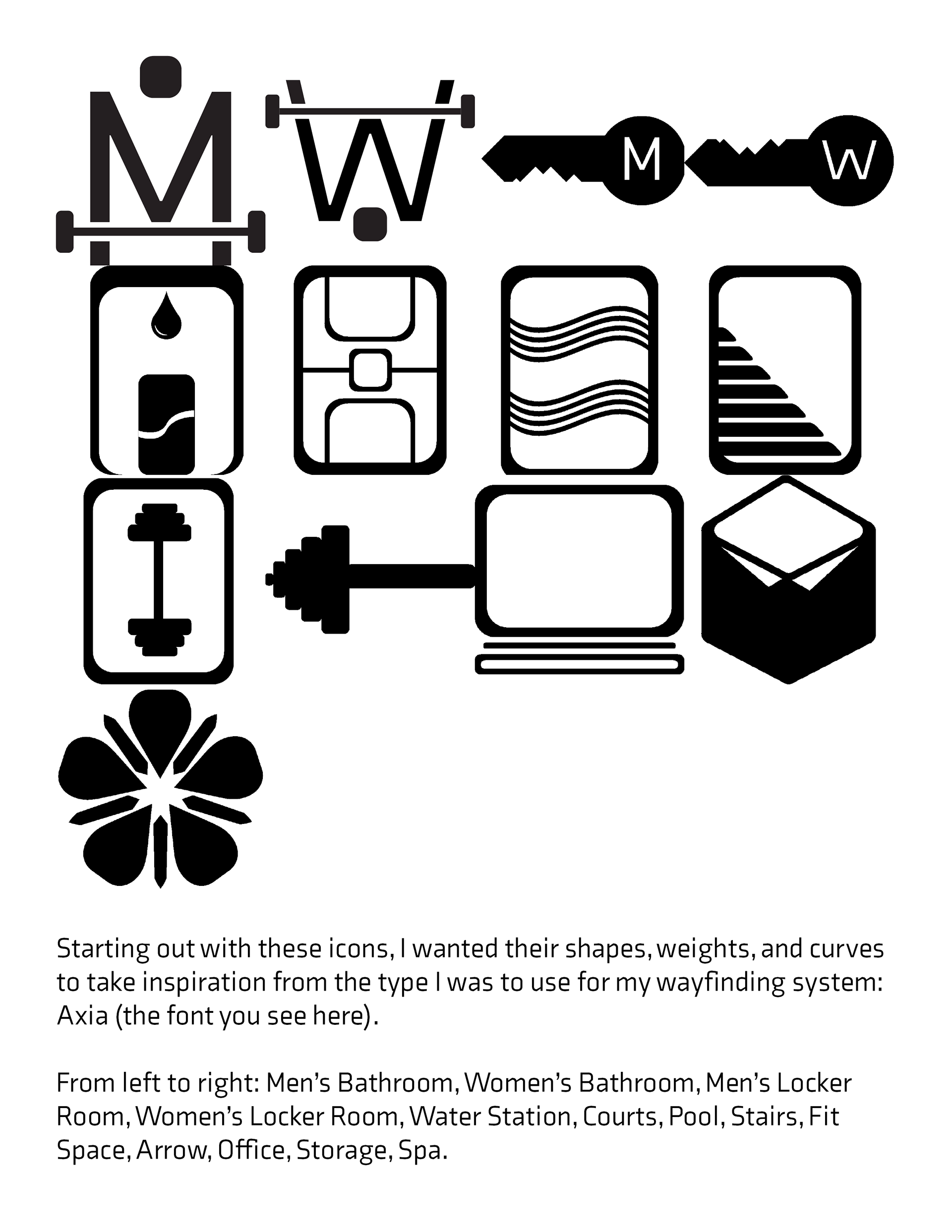
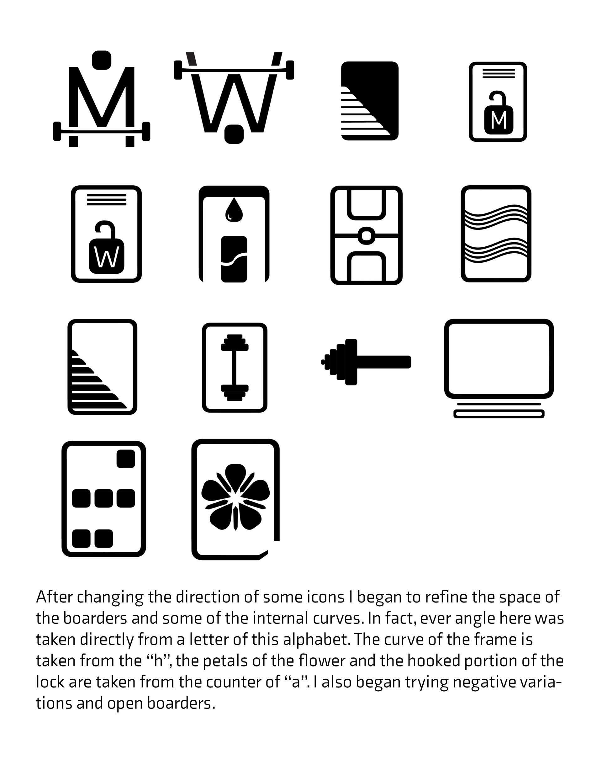
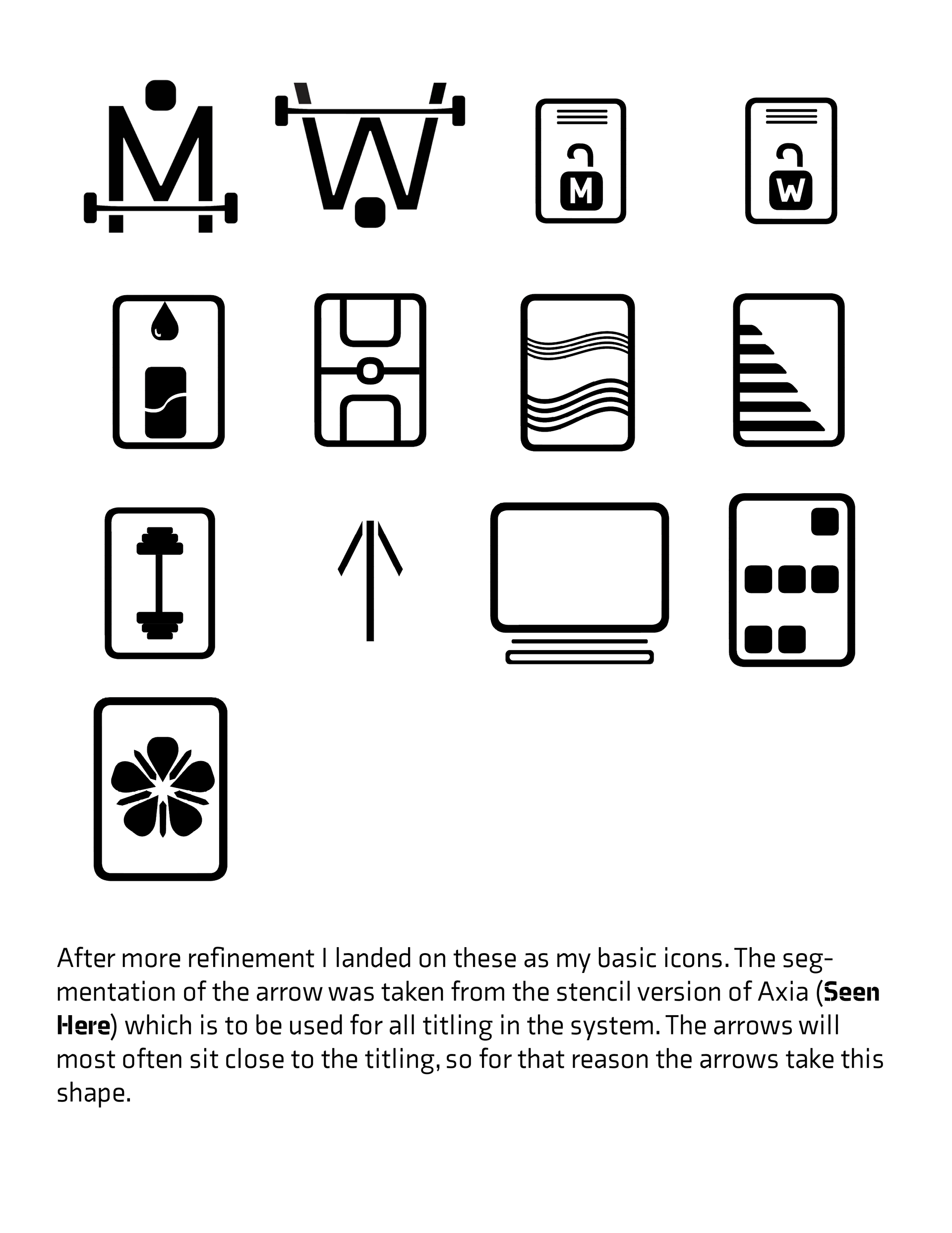
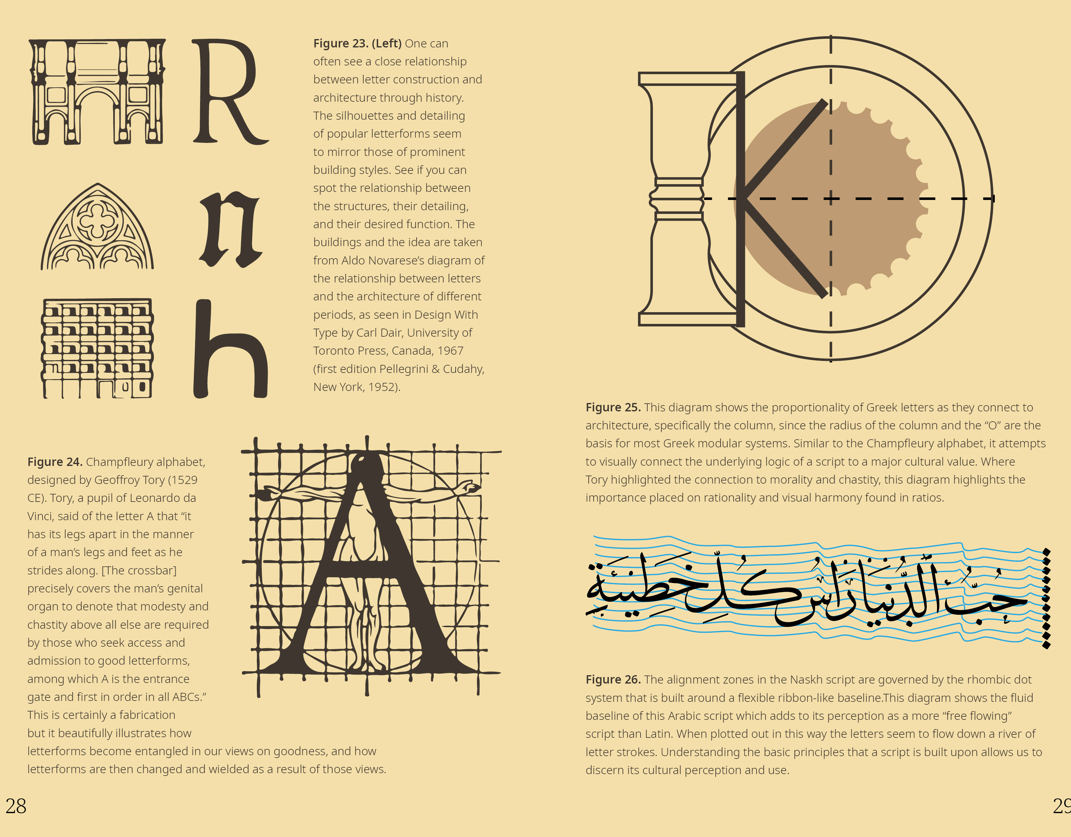
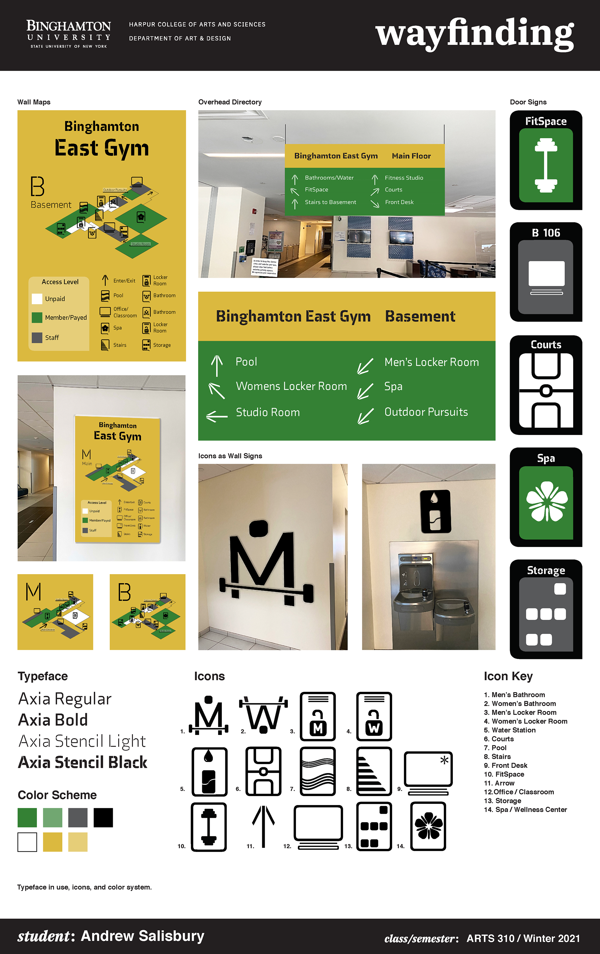
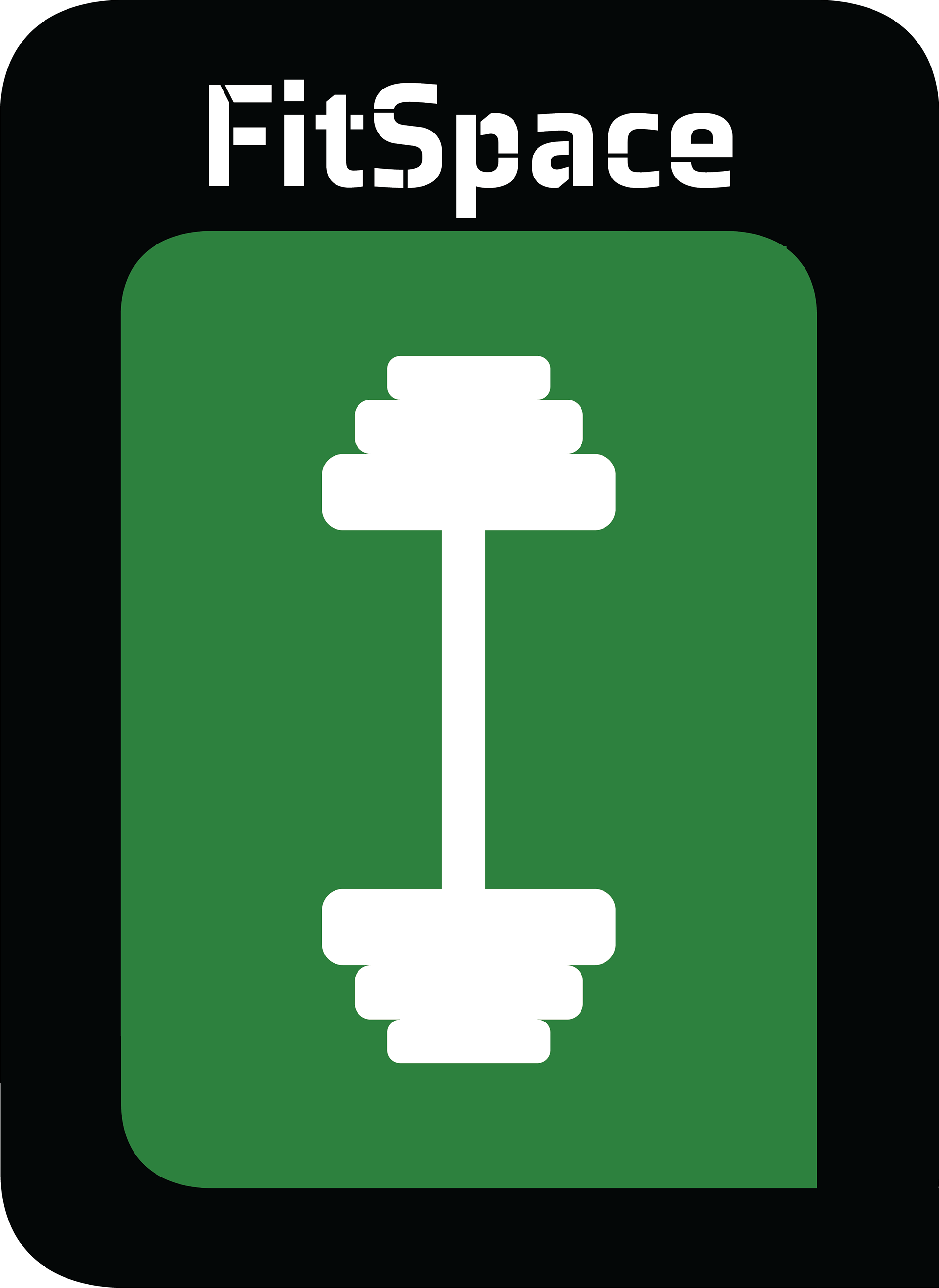
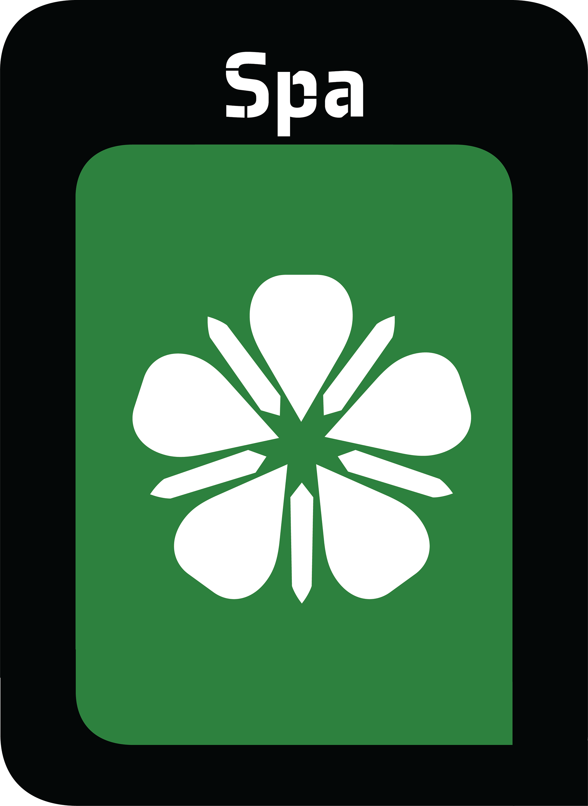
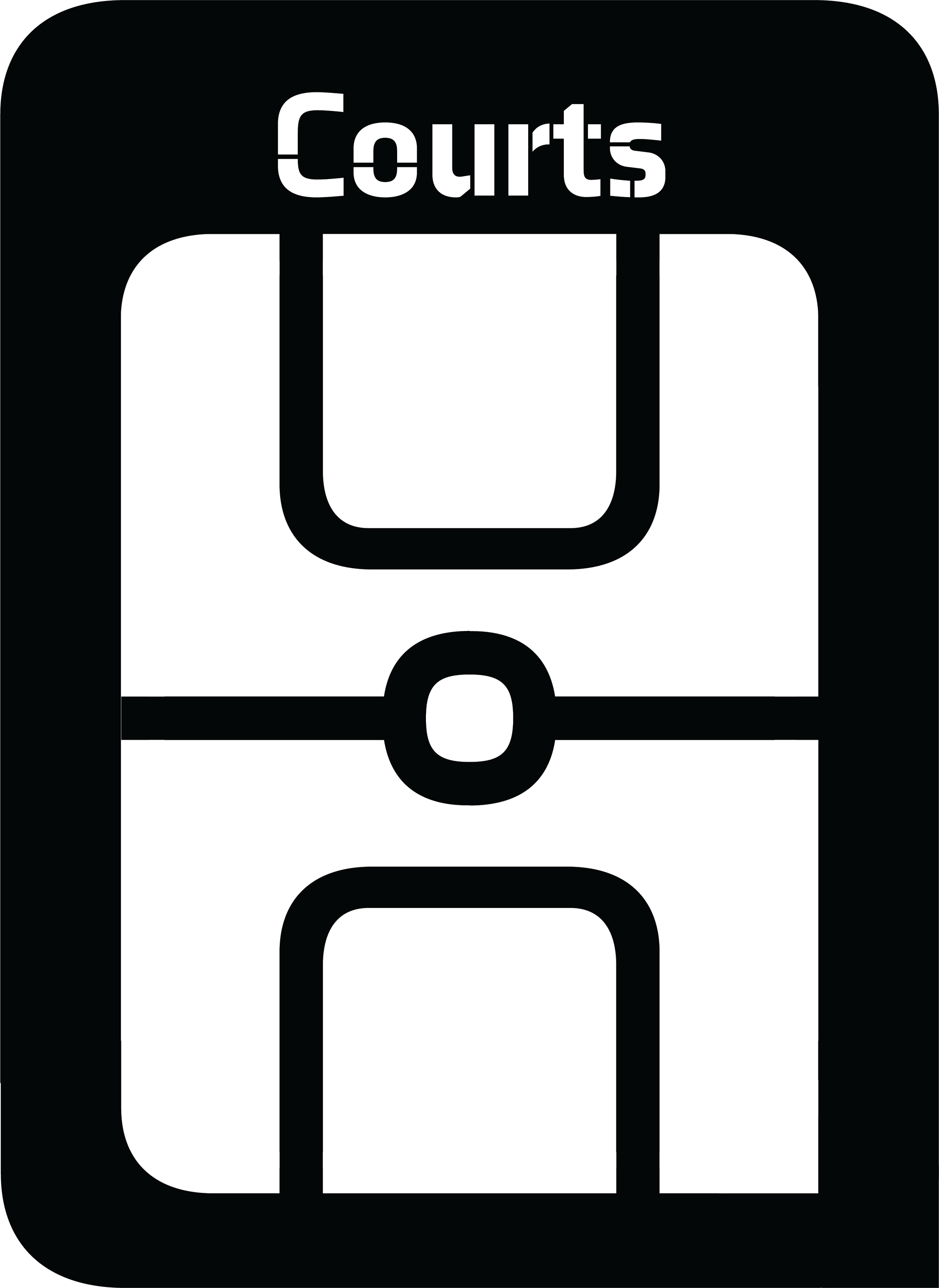
The design needed to be bold, strong, yet playful to encompass all the East Gym should be. Thus, the typefaces Axia and Axia Stencil were chosen. Their strong angles, consistent curvature, and ability to work with other elements or sit firmly alone made them great choices. The color scheme takes inspiration from the green, white, and black Binghamton is known for but adds some playfulness, and necessary contrast with its yellows. The shapes of the icons, signs, and maps come directly from characters in the Axia typefaces. This allows every shape and angle in the system to be consistent and mimic the positive qualities of the typeface already mentioned.
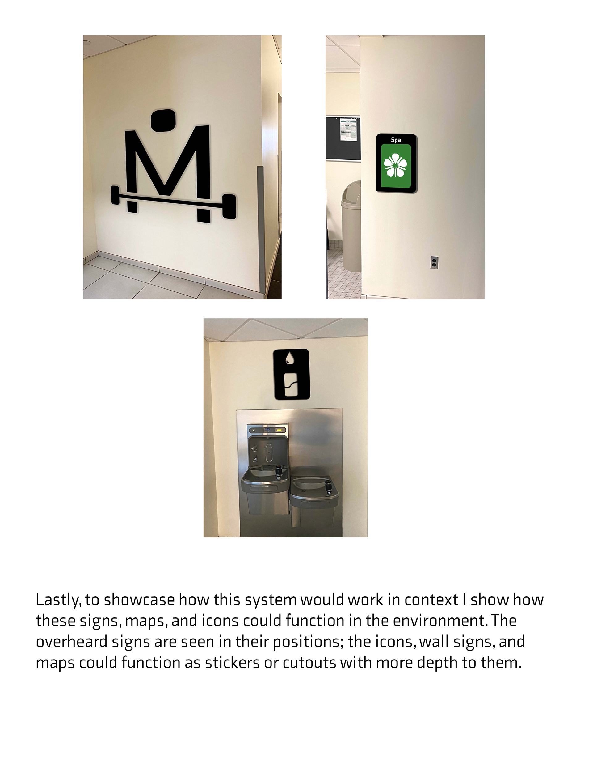
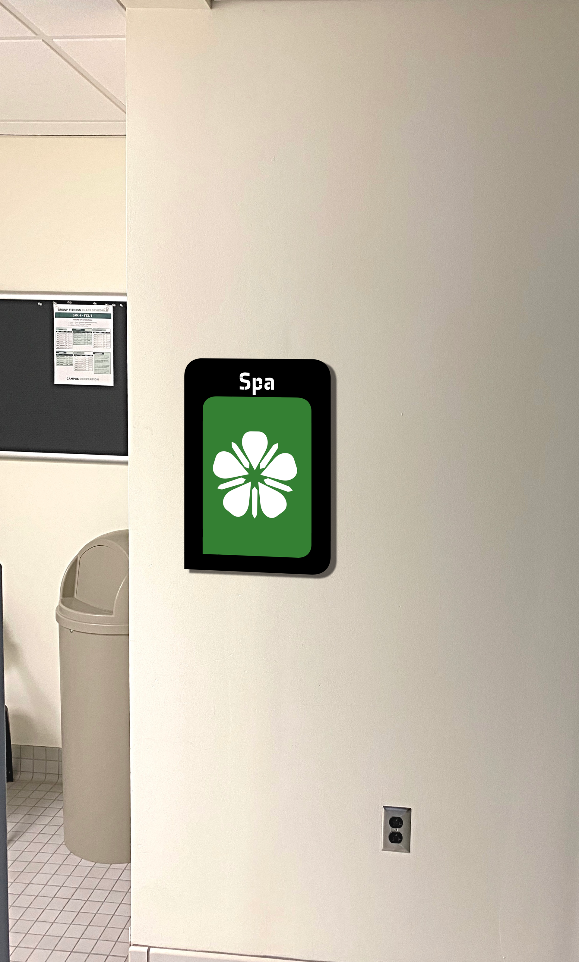
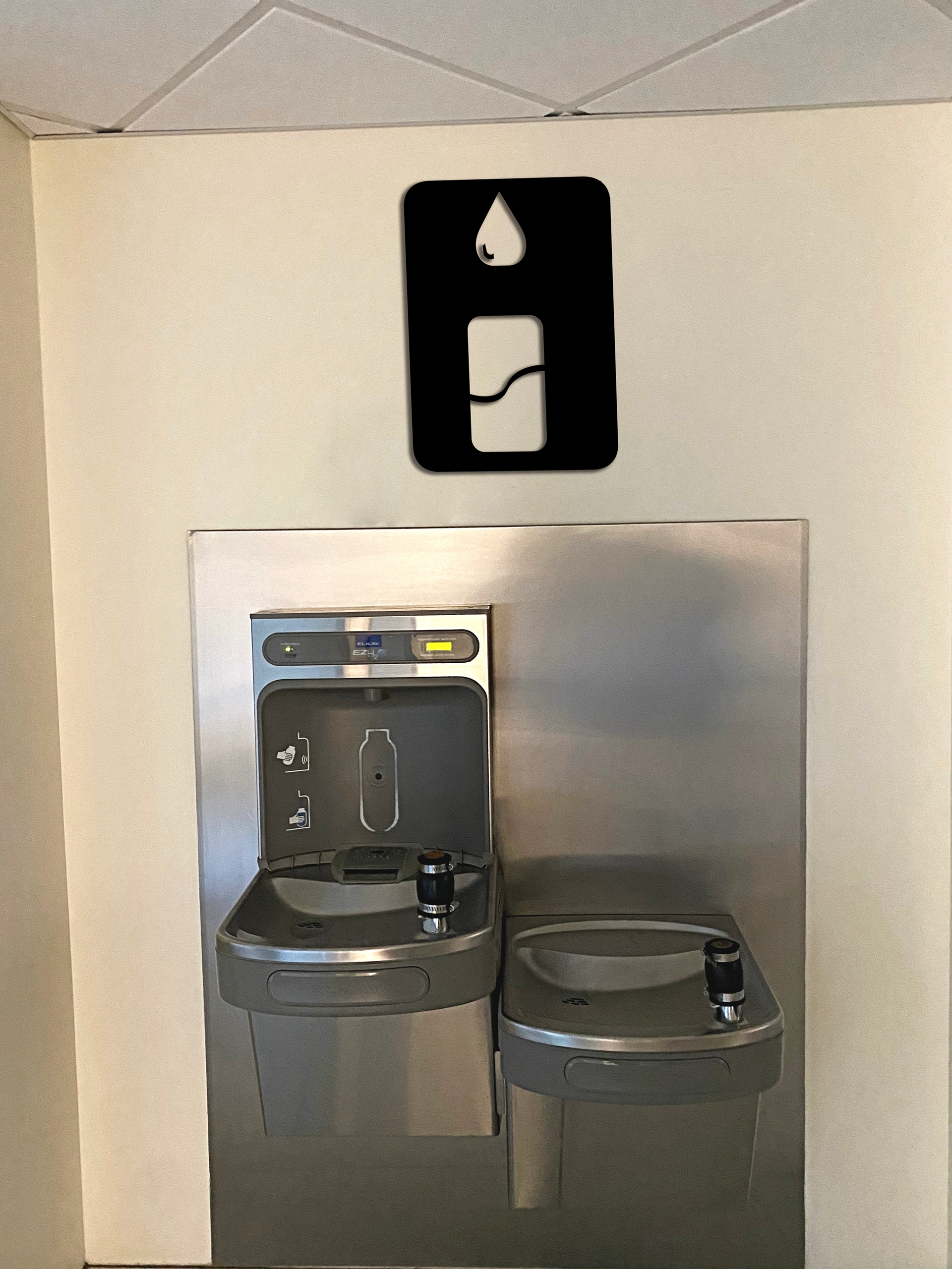
The shape of the logo frames comes from the arch of the "h", the pedals of the spa flower and the water droplet come from the counter of the "a", and the hook of the lock comes from the top arm of the "a". These details allow for consistent visual quality throughout the entire wayfinding system.
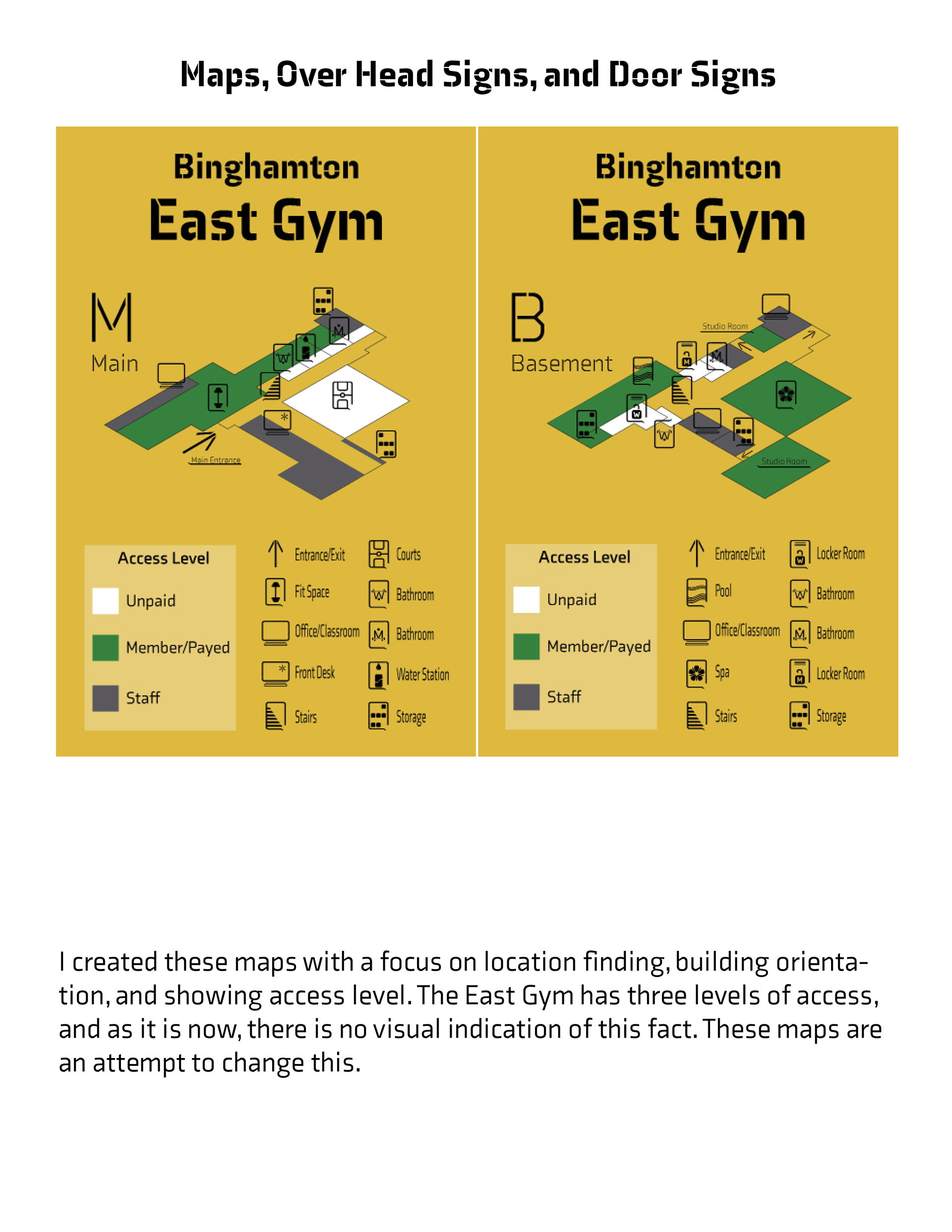
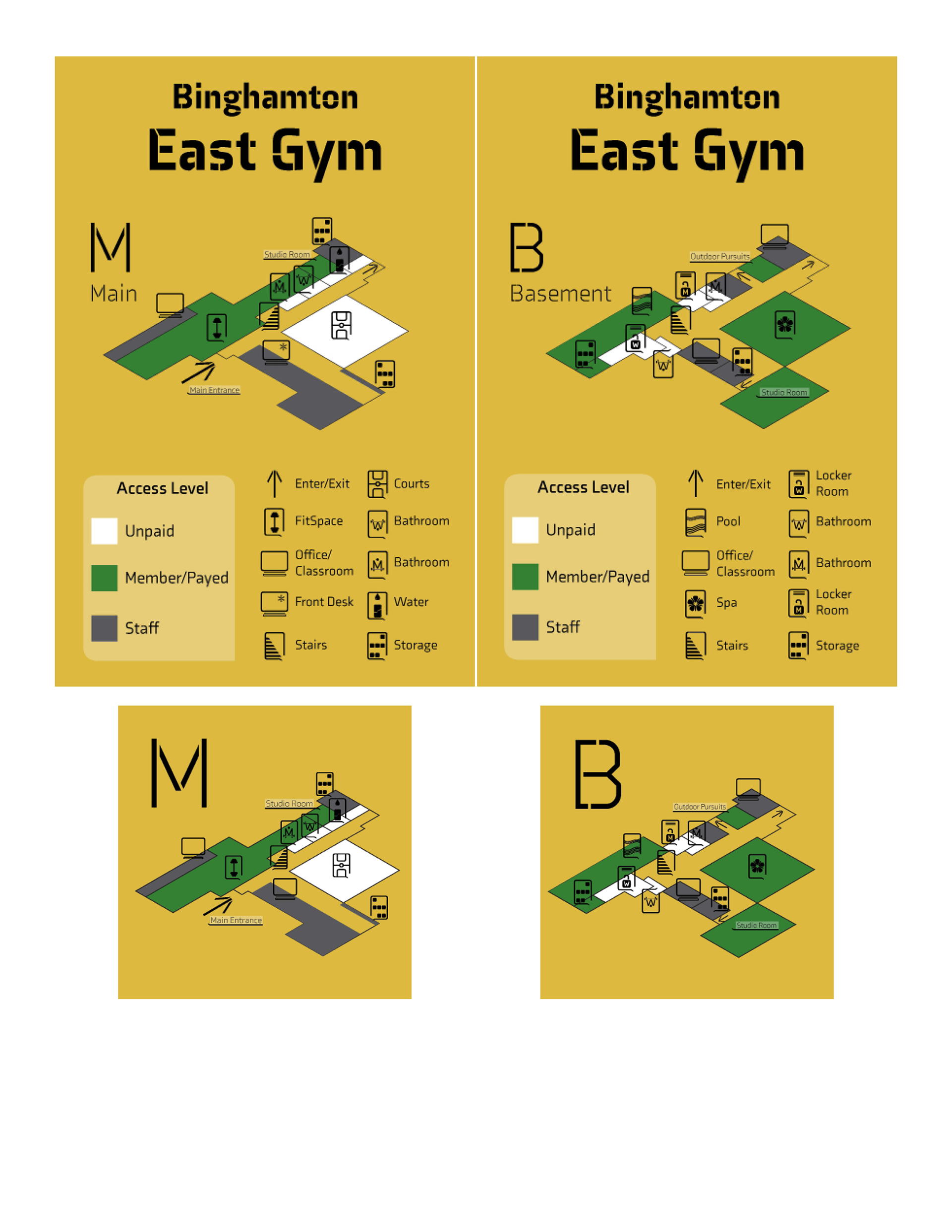
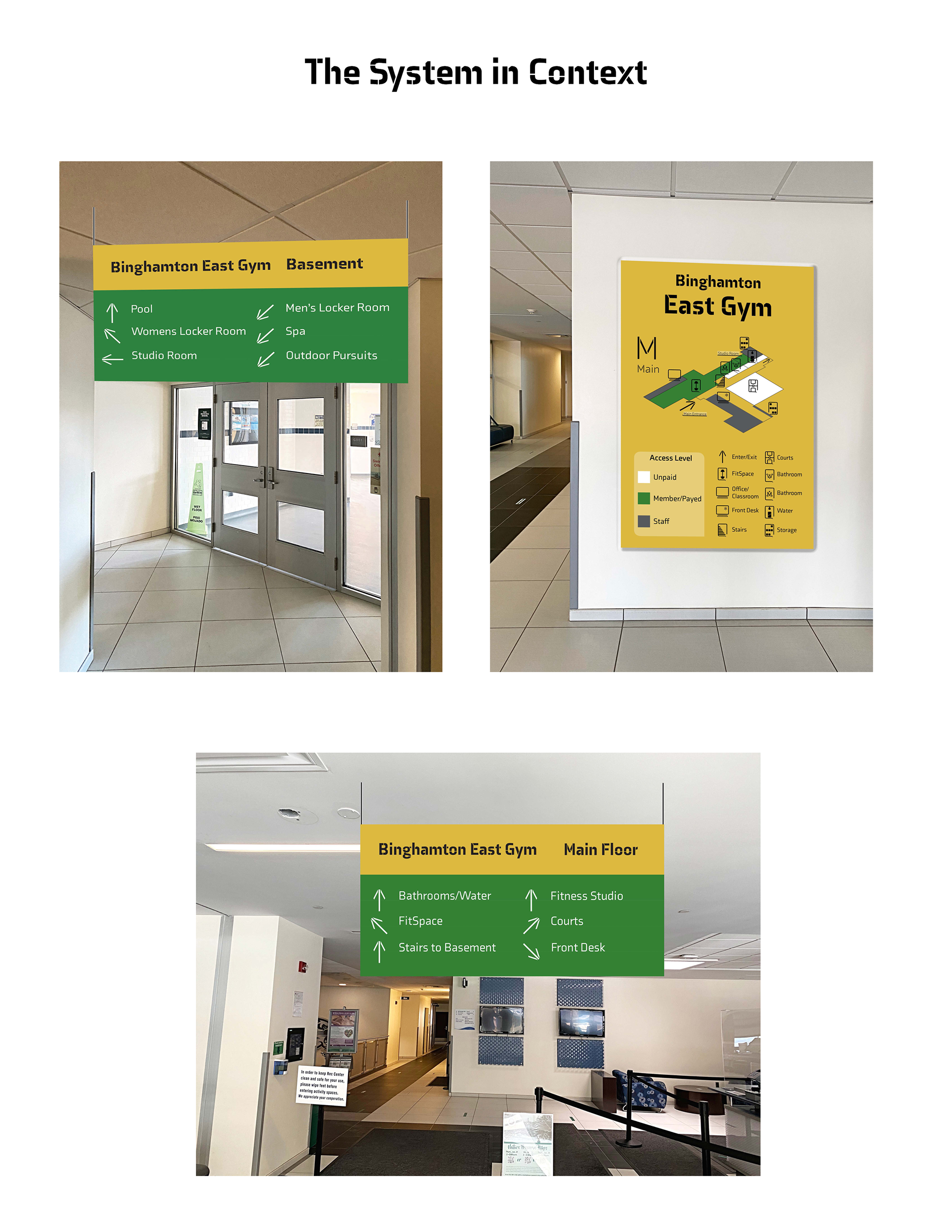
Maps

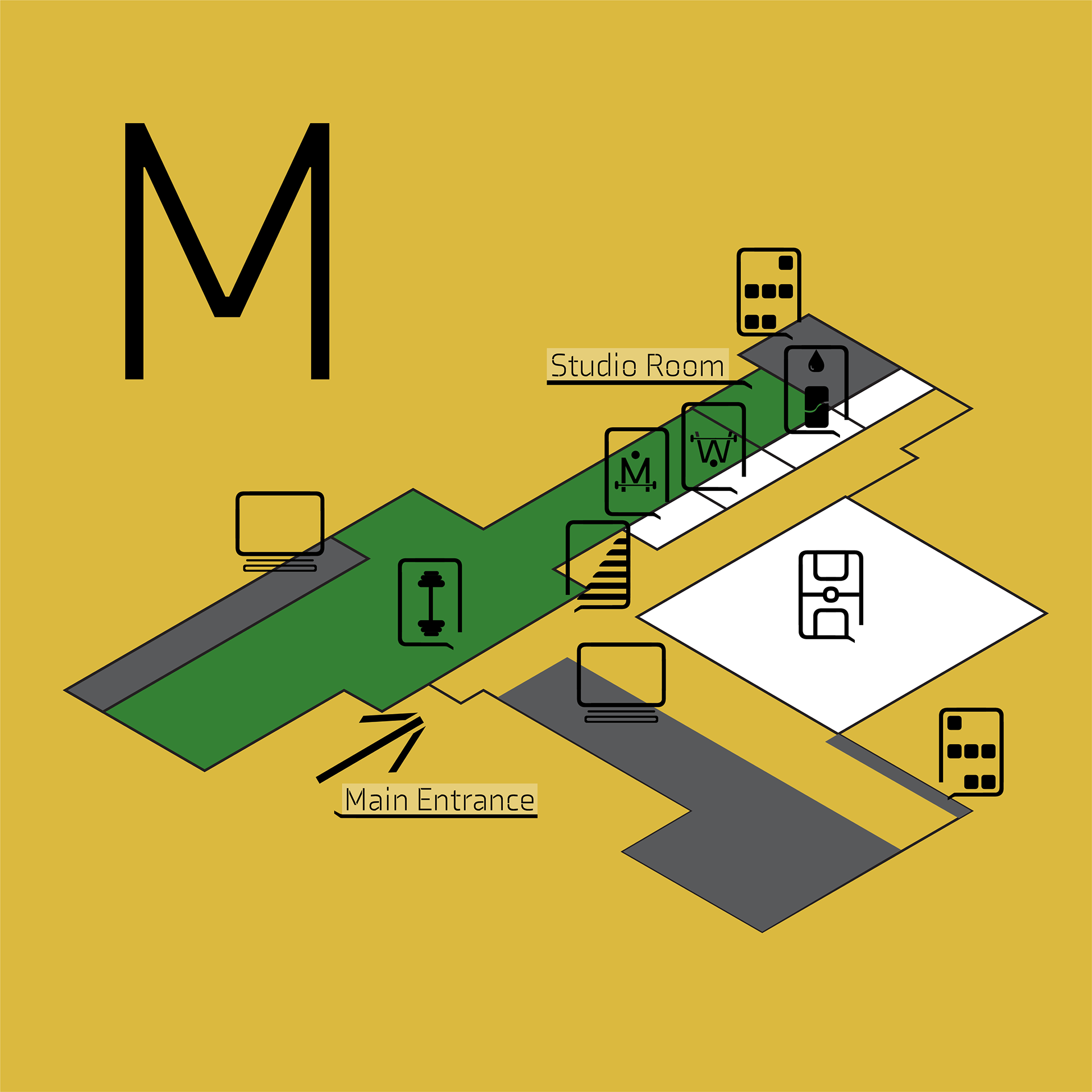
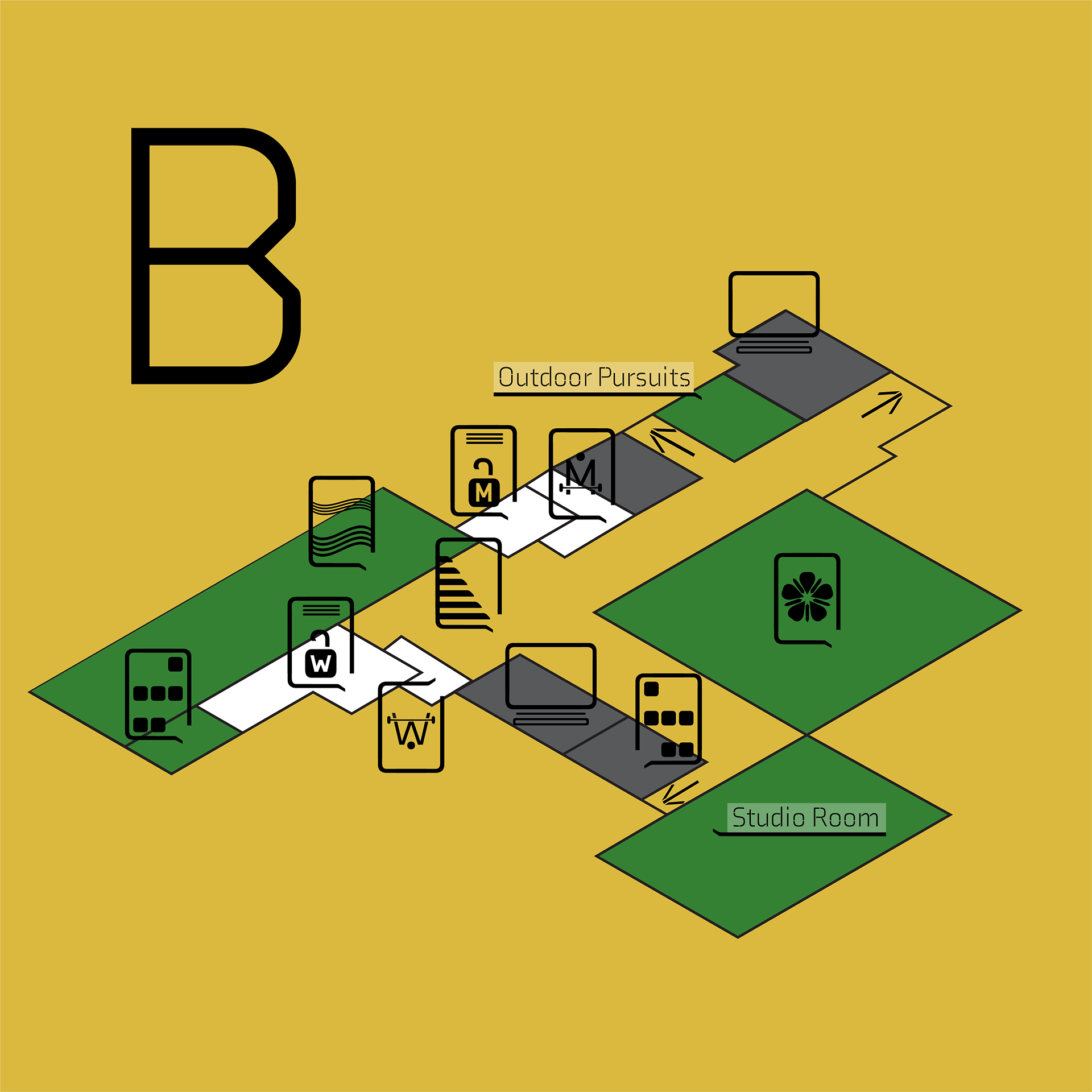
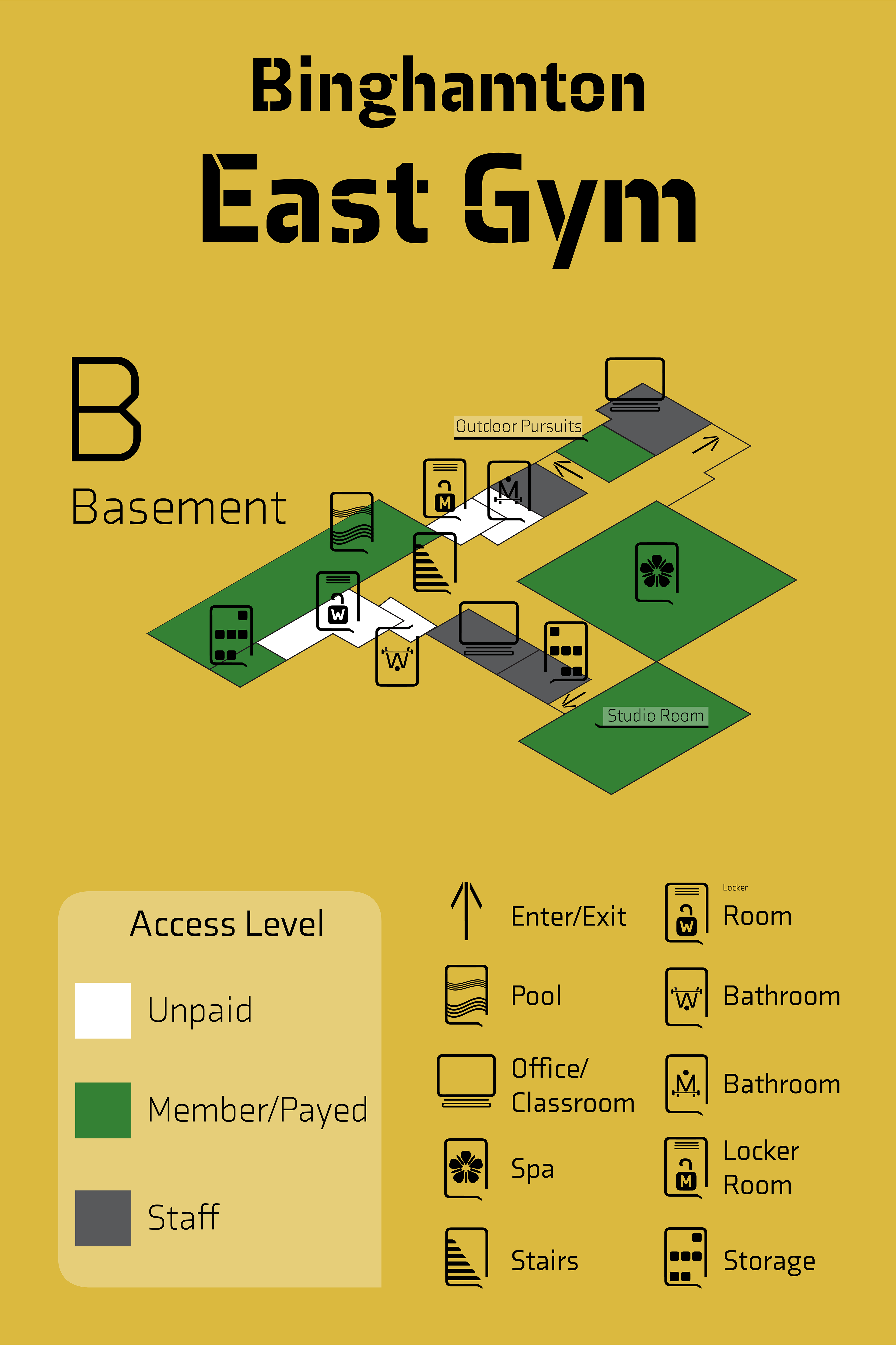

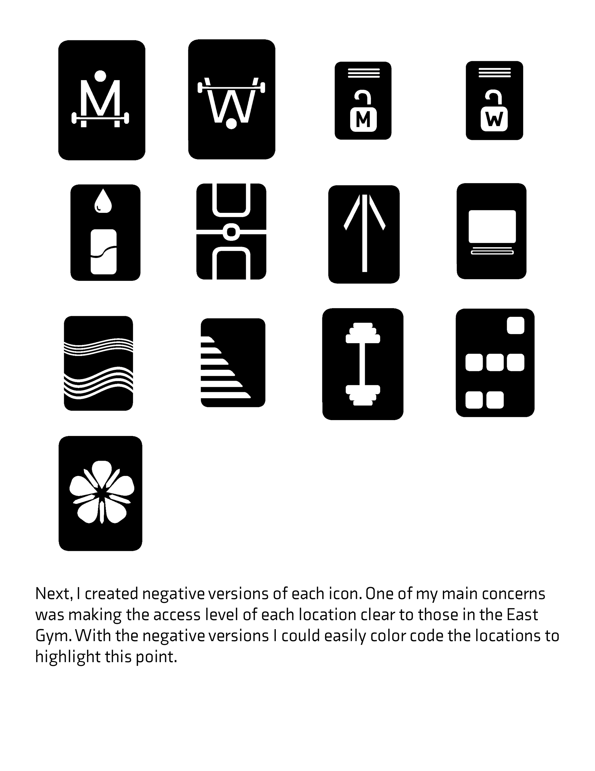
The East gym is composed of two floors, each with two main hallways at a 90-degree angle. The major entrance point to each floor is at the vertex of the angle. This makes for linear circulation paths in which the primary decision point is that vertex. Thus, ensuring users understand the simple “L-shaped” layout, and what they can find down each hallway made for a simple solution to help them find their way. Another problem this system hopes to solve is helping users understand the access level of each activity and room. The three access levels are unpaid, membership, and staff.
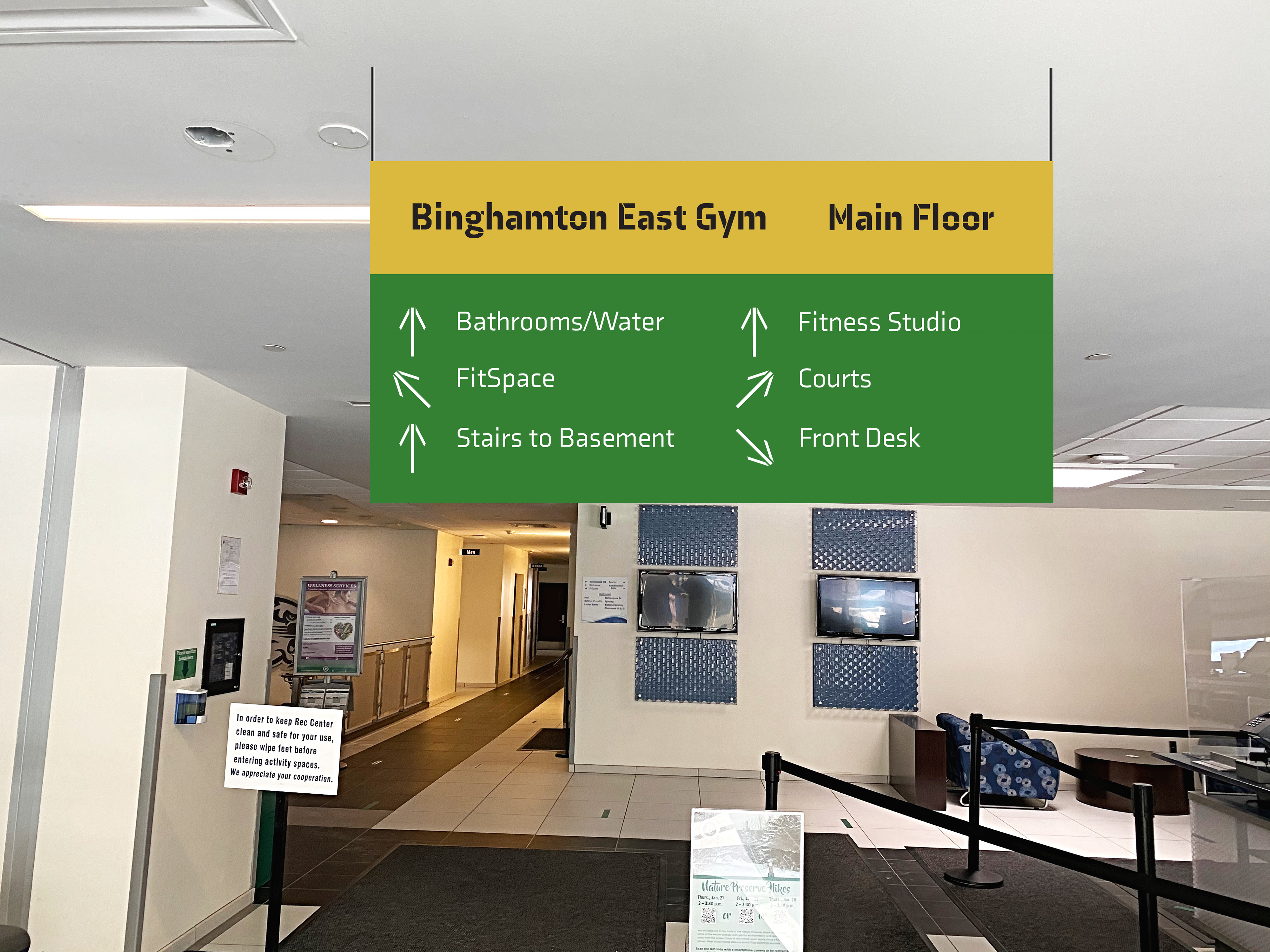
The wayfinding system is separated into three major components: the layout maps, the overhead directories, and the wall/door signs. The maps, visible from each entry point are to orient the user in the space, give a visual of the hallway layout and the order of rooms down each hallway. On the maps is also a key for the access level color-coding to inform the user of the facilities they can use based on their status.
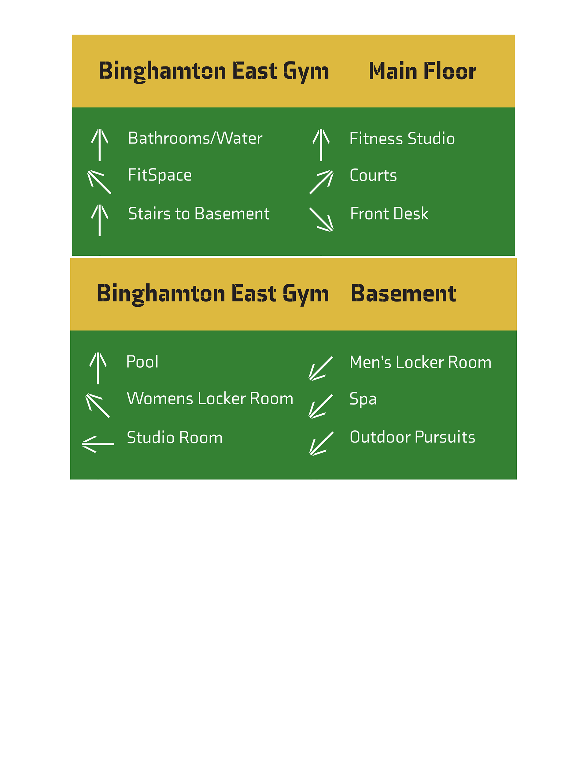
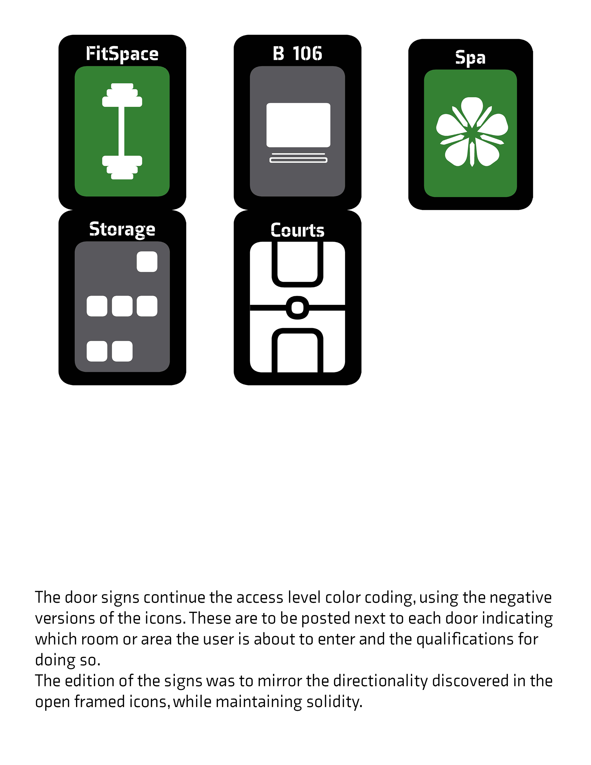
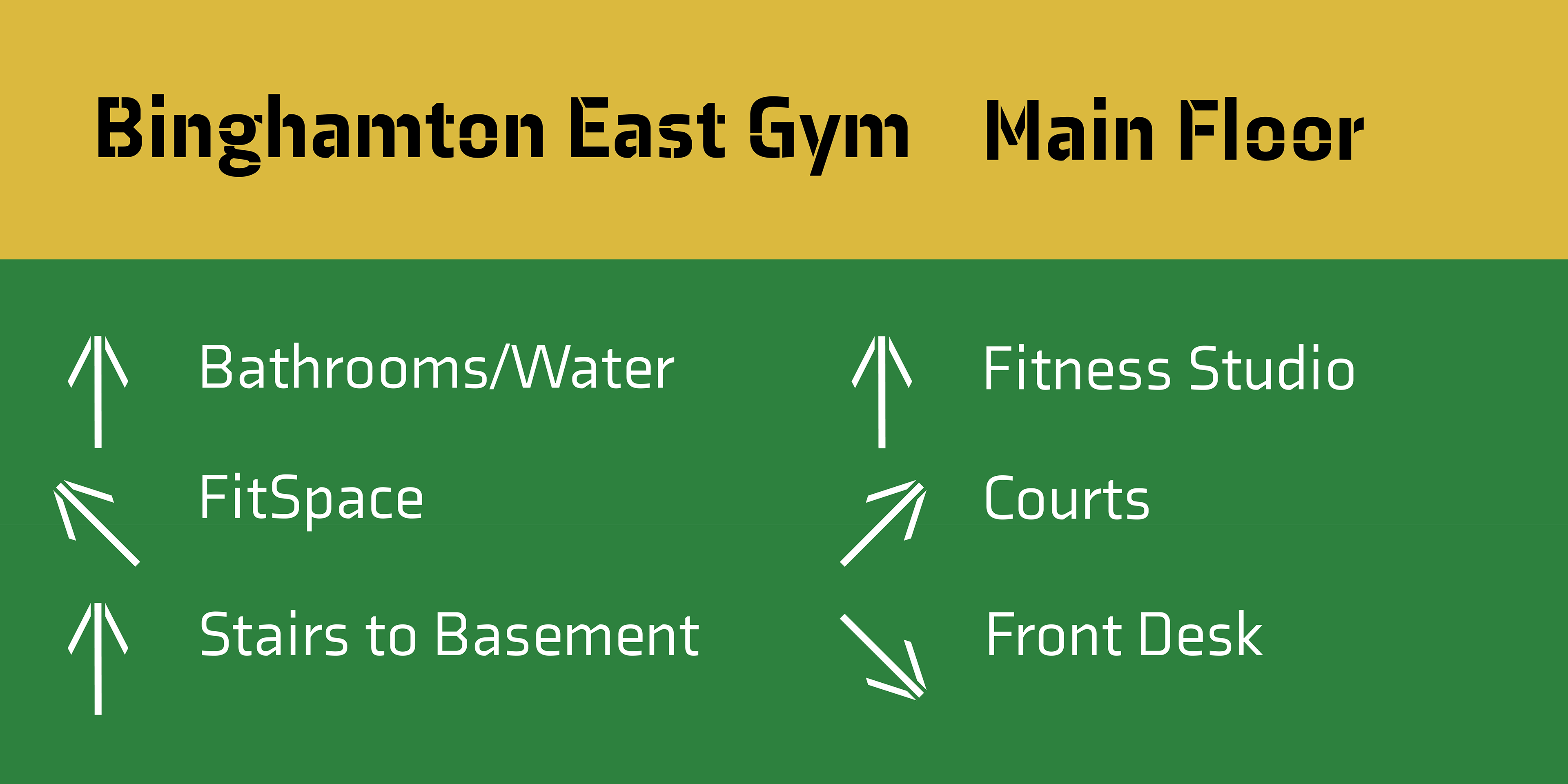
The overhead signs, placed at the junction of each set of hallways, detail which direction (left or right) each major room is in and indicate the order of the rooms. Lastly, once the user is on their way down the proper hallway, each room or space will have a color-coded sign indicating the room, the room number (if necessary), and the access level. The system is simple, tiered, and color-coded for the greatest ease of understanding the space.
Signs
Details

14 icons | 4 maps | 5 signs | 1 presentation sheet |
100 hours
Medium: icons, maps, and signs (AI), mock-ups (PS), presentation layout (ID)
Mentor: Alessandro Segalini
Process